Introduction to visualizing data with ggplot
This introductory overview of using the ggplot2 package
is intended to be relatively beginner-friendly, but also assumes that
you have basic knowledge of how to use RStudio. The aim here is both to
explain and demonstrate the usage of R syntax for a number of data
visualizations, and to act as a repository of useful chunks of code that
you can return to and use again in the future.
ggplot2 is a visualization package that allows users to
customize plots by data-type, themes, colours, and more, in an intuitive
layer-based coding framework. It is stylistically quite different to the
plotting system that comes with R by default (which you may
hear described as “base” R), and while it is possible to
make excellent plots in base R most practitioners find
ggplot2 easier and more efficient for creating
professional-level data visualisations.
ggplot() function from ggplot2
package
Note that you may need to install the ggplot2 package if you have not
previously (see here for information about
installing packages); alternatively it will be installed automatically
if you install the tidyverse package. It needs to be loaded
before use in the usual way.
library(ggplot2)The ggplot() function initializes a ggplot object
and requires the following arguments, which can all be found in the
ggplot help file in the lower right pane of RStudio by running the code
?ggplot.
- data - To use
ggplot(), you must have already loaded a data set object into the environment, or you can use a data set already saved inR(like in the following example). Thedata =argument of theggplot()function is where you can include the data set object name, and is often referred to as the data layer. - mapping - Within the
mapping =argument is where you code how you want theggplot()function orgeom_layer to ‘look’. This is done in large part with theaes()function.aes()stands for “aesthetics” and therefore is where you code how you want your plot to look by stipulating which variables from your data layer are assigned to which aspects of your plot. Theaes()function can be used in multiple layers to code various aspects of your plot.
ggplot(data = iris, mapping = aes(x = Sepal.Length, y = Petal.Length)) Running the above code will initialize a blank plot (a grey
rectangle) in the plot window, with only the labels for the x and y
axes. This is because the only information we have passed to the
aes() function is that we would like a plot with
“Sepal.Length” on the x-axis, and “Petal.Length” on the y-axis. We have
not yet coded what kind of plot we want like whether we want
points or lines or bars. This is where geom_ layers come
into play.
Note: Unlike when coding with the
plot()function, the variables insideaes()do not include the data file name proceeded by$( i.e., datafile$variable), because the data argument has already been specified in the data layer (i.e.,data =). Theaes()function will refer to the data set in the data layer until instructed otherwise.
To visualize your data using ggplot(), you need to add
at least one geom_ layer to pass to
theggplot() function to add features to your plot. In our
case, we want to recreate the scatter-plot we produced above with
plot(), so first we need to add a plus +
symbol after the ggplot line of code, then we will add a
geom_point() layer so that the data will appear as points
in the plot.
If you forget to add a + symbol between layers, an error
will pop up in the console. It is a good idea for each layer to start on
a new line so that you can easily locate each layer;
ggplot() functions can have many layers!
ggplot(data = iris, aes(x = Sepal.Length, y = Petal.Length)) + # <-- Don't forget the '+' symbol!
  geom_point()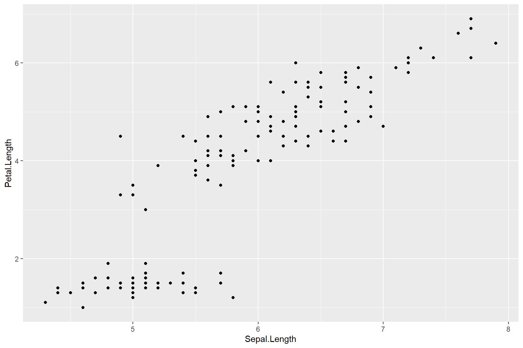
The ggplot() figure is starting to resemble the graph we
produced with plot() above, except that the points we made
with plot() were triangles that were coloured by the
Species variable. To change the colour of points in the
geom_point layer, we will add an aes() within
the geom_point layer so that we can assign colour by
“Species” from the data layer.
Note: A legend is automatically included to the right of the plot once we use the
colour =argument.
ggplot(data = iris, aes(x = Sepal.Length, y = Petal.Length)) +
  geom_point(aes(colour = Species), shape = 17)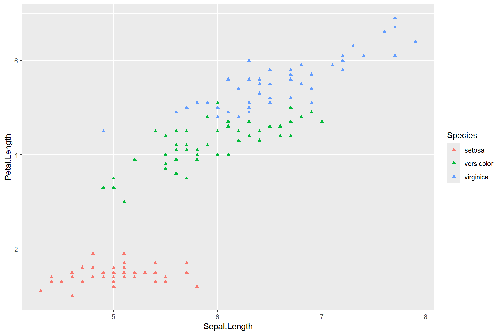
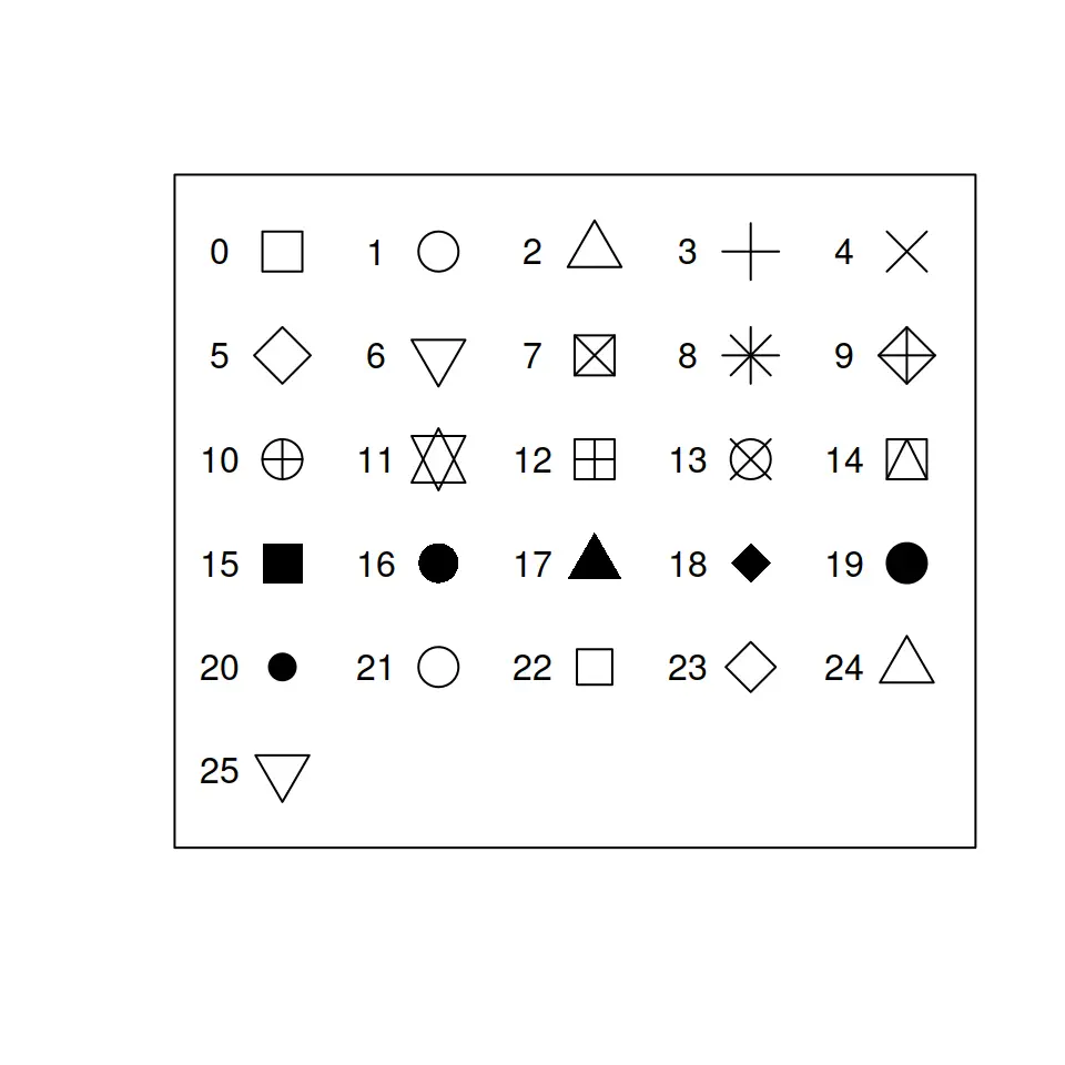
The shape = argument in the above code referred back to
the geom_point function because it was excluded from
the aes() parentheses, but included in the
geom_point() parentheses. We can use the same symbol chart
that is understood by base R (right) to create triangular
points in the plot. Try running the code again with a different shape
from the symbol chart to familiarize yourself with the
shape = argument.
Tip:
Unmatched parentheses can be a great source of frustration for the beginning coder, because they aren’t easy to spot. If you get an error, check that your parentheses always open and close, and that your code segments rest within the correct pair of parentheses. To help you see the opening and closing sides of parentheses, turn on “Rainbow Parentheses” from the “Code” menu. Matching parentheses will then show as the matching colours. More on rainbow parentheses in the troubleshooting guide.
The colour = argument within the aes()
function allows us to colour the geom_ according to a
variable in the associated data file (i.e., “Species”). Because the
Species variable is classed as categorical, each point has a distinct
colour in the plot above. If we chose a continuous variable, the points
would be assigned a colour along a colour-gradient that spanned the
breadth of the data. Try it by creating a plot coloured by the
continuous variable “Petal.Width” like the plot below.
ggplot(data = iris, aes(x = Sepal.Length, y = Petal.Length)) +
  geom_point(aes(colour = Petal.Width), shape = 17)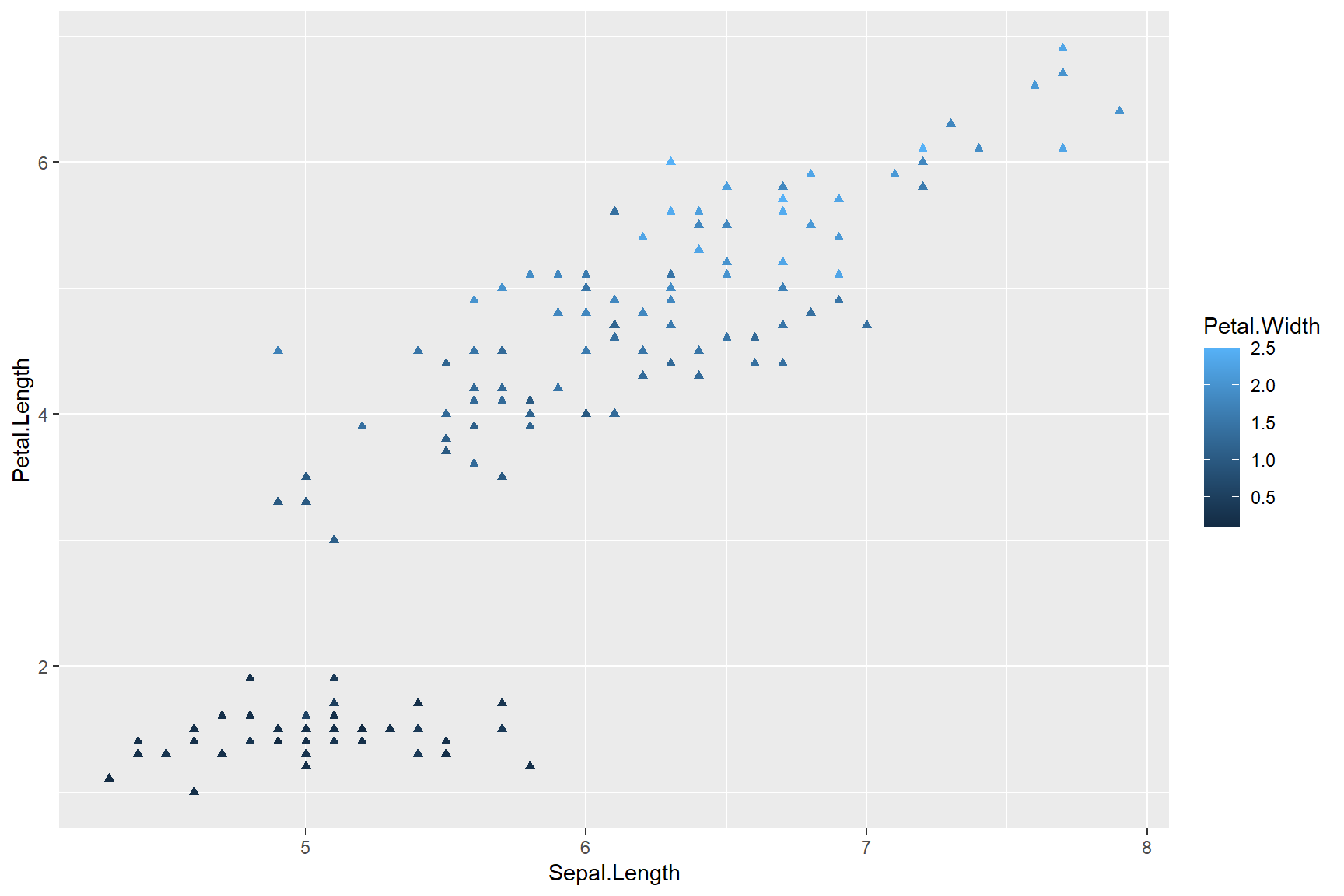
Geoms
The geom_ layers (“geom” is short for geometric object)
allow you to generate many types of graphics including bar charts
(geom_bar or geom_col), box and whiskers plots
(geom_boxplot), and histograms
(geom_histogram). Each of these differ in their arguments
and the ways in which you can customize them. The best way to get to
know about any function in R is to spend some time in the
help files. It can feel daunting at first as you learn the language of
R, but with time, you get better at understanding the
elements of syntax and at finding the relevant information that you
need. Help files can be accessed by typing the name of function you want
help with, preceded by a ? symbol. For example
?plot, ?ggplot, or ?geom_bar.
To demonstrate the usage of the following geom_ layers,
we will be using a different data set that comes installed in
R called mtcars. If you call
mtcars you can see that it contains data that describe
various parameters of different car models.
mtcarsLet’s take a look at each of the geom_ examples I listed
above, starting with the difference between geom_bar and
geom_col for creating bar graphs.
Bar charts
If you look at the help file for geom_bar, you can see
from the description that geom_bar counts the number
of occurrences of each x-variable by default. This makes the default
usage of geom_bar better suited to looking at the
frequency distribution of a variable, but less well-suited to
displaying how the data themselves are distributed across their range.
To view how the values of a data variable are distributed, the default
usage of geom_col creates a more straight-forward bar-graph
visualization.
Take a look at plots produced by geom_bar (left) and
geom_col (right) below. The fill = argument of
either geom_bar or geom_col fills the bars
with a colour that corresponds to a variable in the data layer, in this
case the number of cylinders (cyl) that each car’s engine
has. In the plot on the right, miles-per-gallon (mpg) for
each car (rownames(mtcars)) is included. More on this
below.
There are a few things to note about the following code chunk and the plots below:
The variable
cylin themtcarsdata set is classified as numeric but we want it classified as a factor (categorical variable) so that each different level ofcylis filled with a unique colour in the bar graph(s). To convertcylto a categorical variable, the below code uses thefactor()function to convertcylfrom class numeric to class factor. Together thefactor()function containing thecylvariable (factor(cyl)) now becomes yourfill =variable.There is no column in the mtcars data set that contains the names of the cars, instead, the names of the car models are saved as row names in the data set. We can call the row names from the
mtcarsdata set by using therownames()function with the following code:rownames(mtcars). This function, containing the data set, now becomes your y variable (rownames(mtcars)).There is an additional line of code in the below plots that we will discuss in-full later in this lesson: namely themes (
theme()). In the below example,theme()makes text of the the y-axis labels right-justified.
ggplot(data = mtcars) +
  geom_bar(aes(y = rownames(mtcars), fill = factor(cyl))) +
  theme(axis.text.y= element_text(hjust = 1))

ggplot(data= mtcars) +
  geom_col(aes(y = rownames(mtcars), x = mpg, fill = factor(cyl))) +
  theme(axis.text.y=element_text(hjust = 1))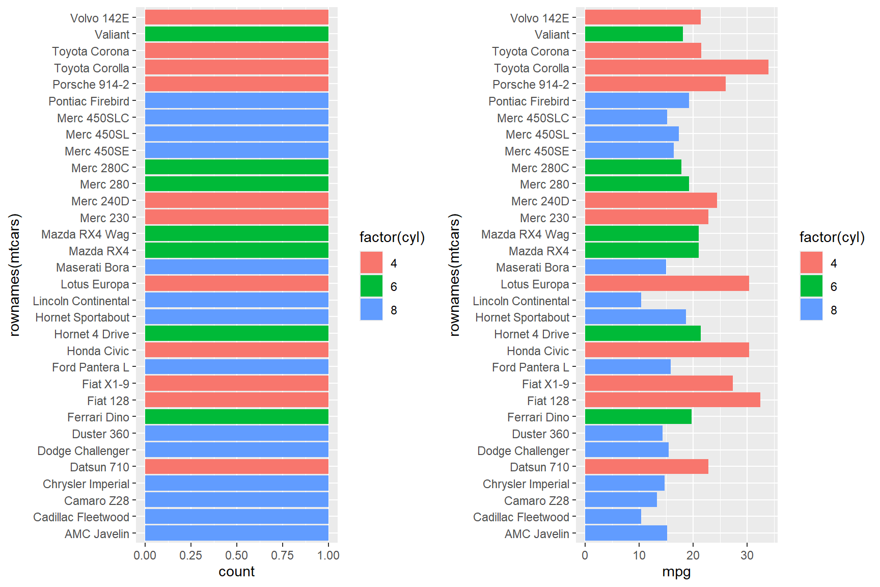
Because geom_bar displays the count of only
one x or y aesthetic, it cannot display more than one data
variable at once (see ?geom_bar). In the plot on the left,
the count of each car is 1, because each car model only
appears once in the data set. The geom_bar has coloured
each bar by the number of cylinders that each car has, but given that
there is only one instance of each car model, this graph isn’t very
informative for the given data set.
The geom_col plot on the other hand, can
include both x = and y = arguments (see
?geom_col), meaning you can demonstrate the relationship
between two variables in one plot. The figure on the right shows a
correlation between miles-per-gallon (mpg) on the x-axis
and car model (rownames(mtcars)) on the y-axis. This is a
useful depiction of the data because it tells a good story: engines with
fewer cylinders (i.e., small engines) can drive more miles-to-the gallon
(mpg) than engines with a greater number of cylinders
(i.e., larger engines).
You can further manipulate the presentation within
ggplot() in a variety of ways. You may notice that the bars
above are orgransed alphabetically by car name (this is the default): to
reorder the car models in the plot by greatest to smallest fuel mileage
we need to reorder the levels of the factor that is created here, by
adding yet another function to the y-variable like so:
reorder(rownames(mtcars), mpg). The reorder()
function allows you to reorder factor levels of one variable in order of
largest-to-smallest value of a second variable. In the following
example, the reorder() function reorders the variable
rownames(mtcars) by the largest-to-smallest values of
mpg.
ggplot(data= mtcars) +
  geom_col(aes(y = reorder(rownames(mtcars), mpg), x = mpg, fill = factor(cyl))) +
  theme(axis.text.x=element_text(hjust = 1))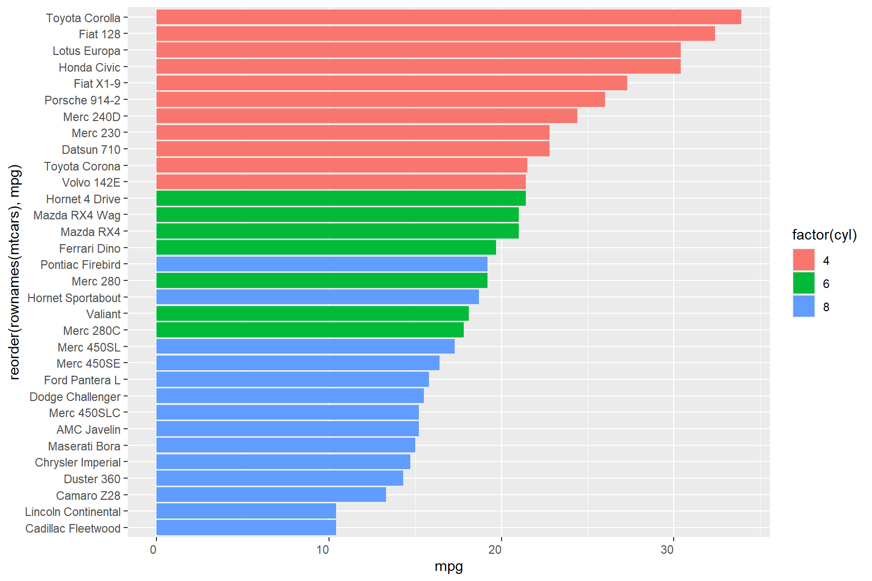
In the above plot, you can see at a glance that the Toyota Corolla is the most efficient vehicle in the data set in terms of fuel mileage, and that the Cadillac Fleetwood is the least efficient.
Box-and-whisker plots
If you look at the help file for ?geom_boxplot, you can
see from the description that geom_boxplot produces a plot
that shows the distribution of a continuous variable, including the
median as the line across the center of the box, approximately the 1st
and 3rd quartiles for the top and bottom of the box, and the minimum and
maximum values as the “whiskers” (excluding outlier values, which may
show as dots above/below the whiskers).
geom_boxplot summarises one numeric value (which may be
either on the x or y axis), and can be grouped in terms of other
categorical variables, either along the other axis, or using colour or
fill. If you add a colour = argument,
geom_boxplot will assign a colour to the border of
the box plots, and if you add a fill = argument,
geom_boxplot will fill the box plots with a colour
according to whichever variable you assign to it.
For example, to create a box plot figure showing the distribution of
data in the mpg variable on the y-axis and show how the
number of cylinders bears on those distributions, we can provide the
y = argument and assign colour to both the x-axis and the
border of the box plots with the colour = argument, like in
the below code chunk.
ggplot(data = mtcars) +
  geom_boxplot(aes(y = mpg, x = factor(cyl), colour = factor(cyl)))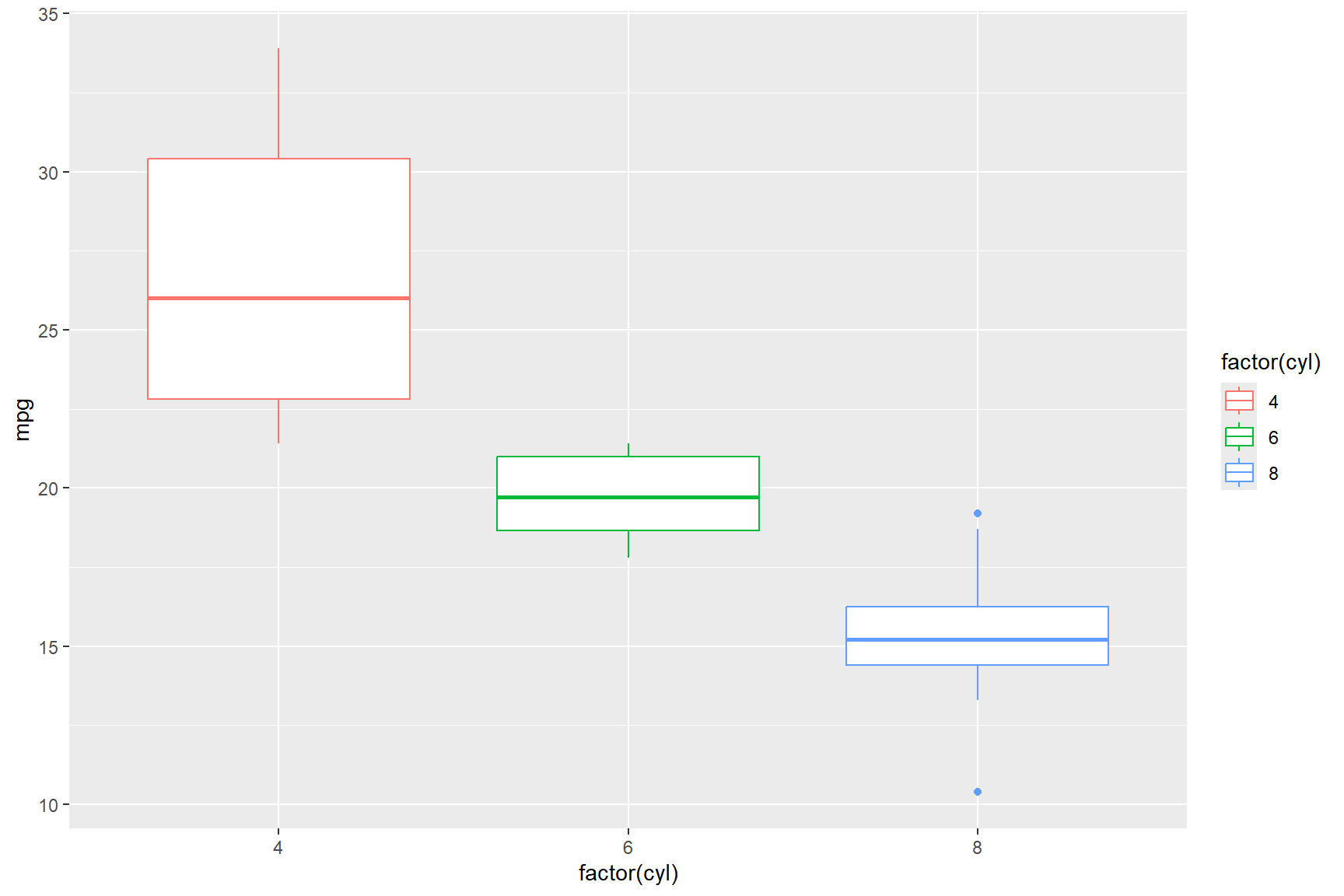
The box plot figure above shows what we knew from the bar charts that we made earlier, namely that cars with smaller engines (i.e., fewer cylinders) get better fuel mileage, but the box plot figure displays the data in a way that doesn’t relate to the car model, it only shows the distribution of miles-per-gallon that cars of a certain size get.
Using different data variables from the mtcars data set, we can
create a box plot figure showing the distribution of the
qsec variable on the x-axis (qsec represents time, in
seconds, in takes to travel ~400 m) and show how the transmission type
(am, o = automatic, 1 = manual) bears on its distribution,
along with the cyl variable. To do this we provide the
x = argument and assign a fill-colour to the box plots with
the fill = argument, like in the below code chunk.
ggplot(data = mtcars) +
  geom_boxplot(aes(x = qsec, y = factor(cyl), fill = factor(am)))
The above box plot figure shows that vehicles in the data set with an automatic transmission are faster at covering the ~400 m distance.
If, for some reason, you wanted the borders of the boxes in the last
plot to be green, you would have to put the colour =
argument outside the aes() function, but
within the geom_boxplot() function, like so:
ggplot(data = mtcars) +
  geom_boxplot(aes(x = qsec, y=factor(cyl), fill = factor(am)), colour = "green")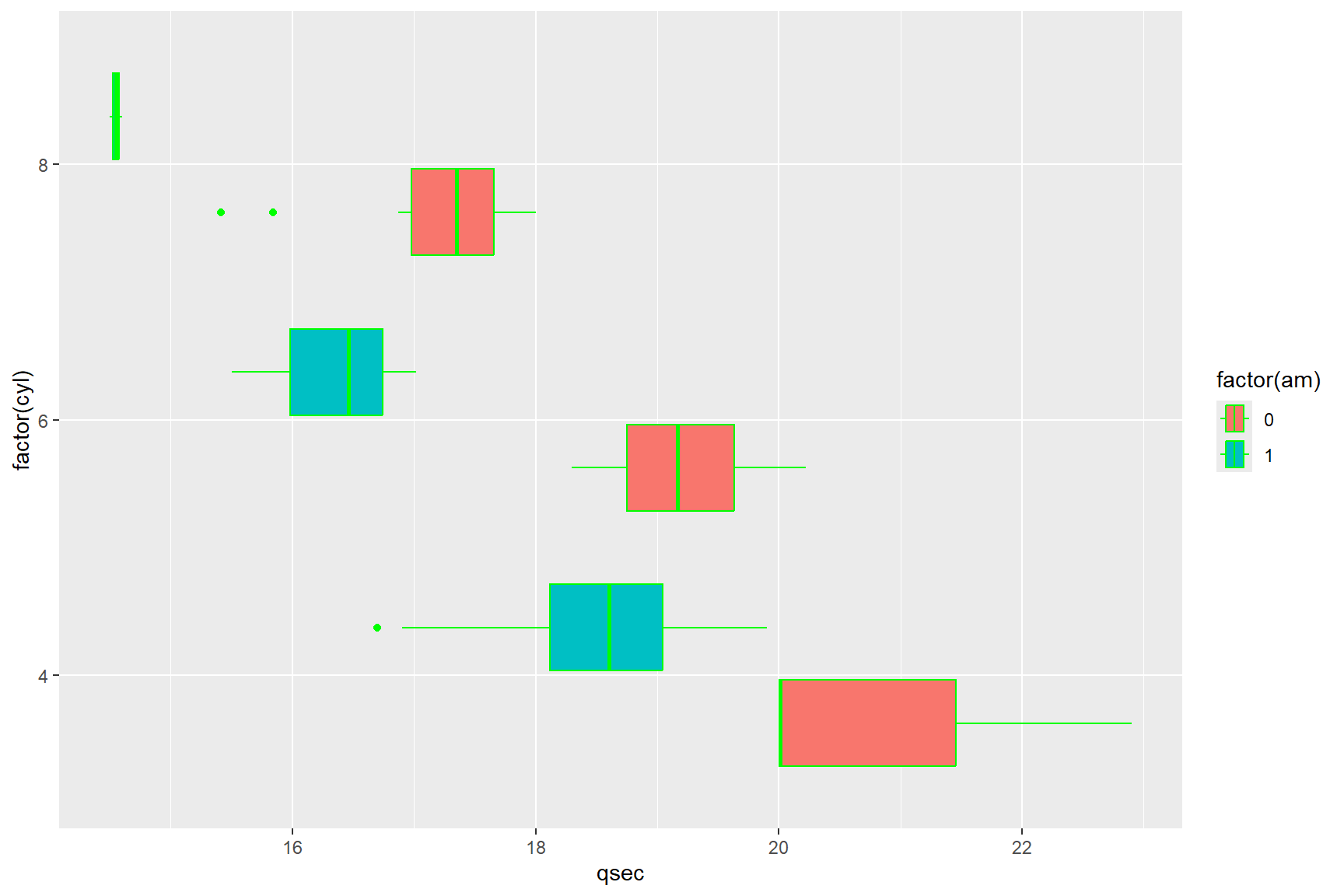
The above figure, although a little jarring to the eye, serves to
illustrate the difference between arguments inside a geom_
function within the aes() function, and those
outside of the aes() function. Arguments inside the
aes() function will always refer back to the data set in
the data layer, whereas arguments within a geom_ function
but outside the aes() argument, require a universal
value, one that has nothing to do with the data set, like a specific
colour or a specific shape. Likewise, if you try to use a universal
value, like the colour green, in an argument inside the
aes() you will get an error.
ggplot(data = mtcars) +
  geom_boxplot(aes(x = qsec, fill = green))
## Error in `geom_boxplot()`:
## ! Problem while
## computing aesthetics.
## ℹ Error occurred in the 1st
## layer.
## Caused by error:
## ! object 'green' not foundThis is because the geom_ layer is trying to call the
variable “green” from your data, and there is no variable called “green”
in the mtcars data set.
A common (and very useful) idea is to present multiple geometric
layers on the same plot. If you wish to show the data as well as the
summary statistics, you can combine geom_boxplot with
geom_point or geom_jitter (which is similar,
but moves the points around a bit so they are easier to see if they were
on top of each other). For example:
ggplot(data = mtcars,aes(x = qsec, y = factor(cyl), fill = factor(am))) +
  geom_boxplot() + geom_point(aes(colour=factor(am)))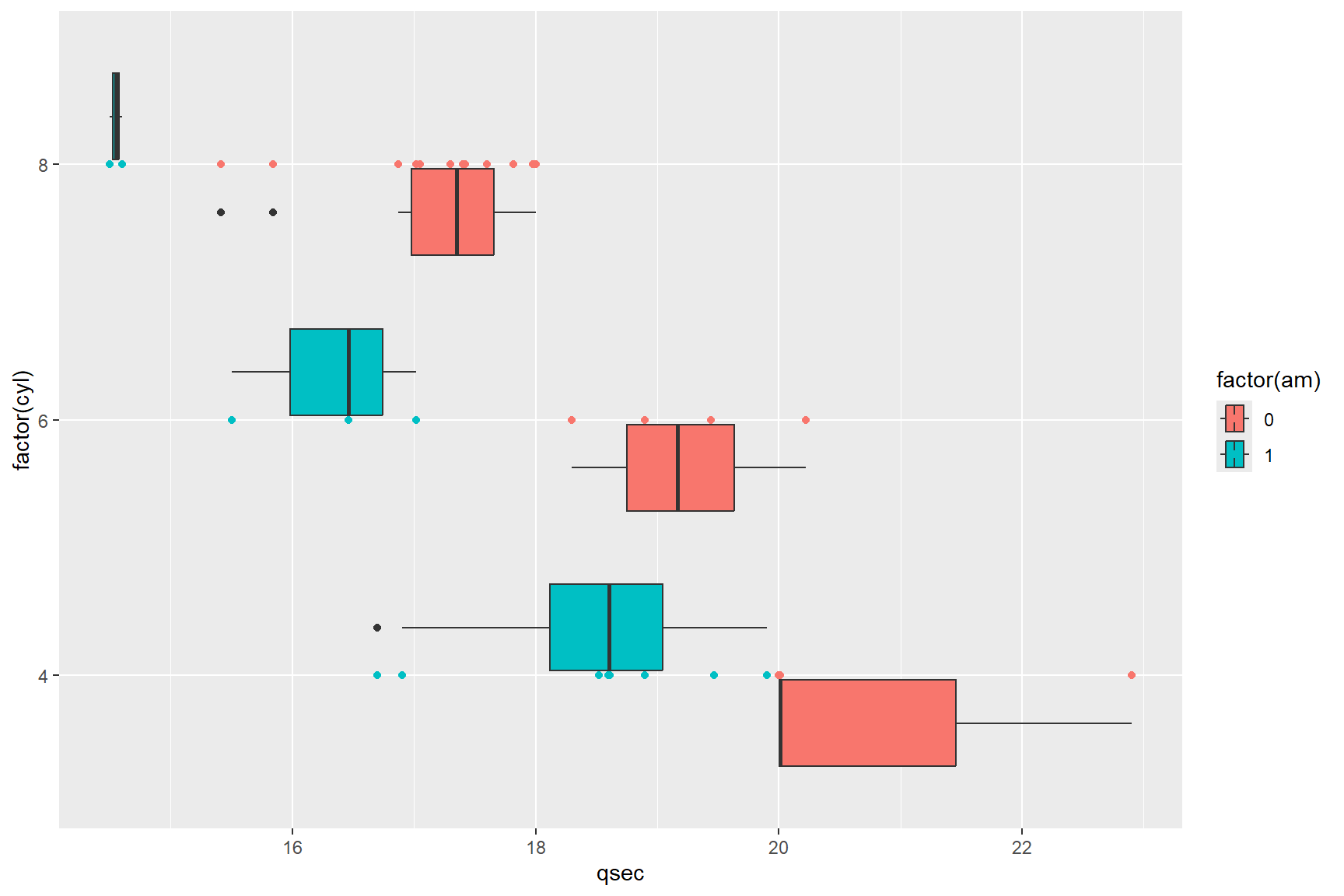
It is important to remember the difference between fill and colour; you will primarily use fill for solid regions like bars and boxplots, and colour for points and lines.
Histograms and densities
The help file for ?geom_histogram describes a
geom_ that allows one to visualize the distribution of a
single continuous variable by dividing the x-axis into ‘bins’ and
showing the number of observations that occur in each bin. The default
bin number for geom_histogram is 30, meaning that by
default, the data will be divided into 30 bins. This isn’t always an
appropriate number of bins for the data, but it can be changed by using
either the bins = argument which as you imagine changes the
number of bins in the plot, or with the binwidth = argument
which changes the width of each bin. The bins = argument
overrides the binwidth = argument, and vice versa, so you
should only change one at a time until you’ve got a histogram that
depicts the shape of the distribution of your data (i.e., normal,
bimodal, etc.).
A histogram of the mpg data from mtcars
with the default number of bins (30) looks like this:
ggplot(data = mtcars) +
  geom_histogram(aes(x = mpg))
## `stat_bin()` using `bins =
## 30`. Pick better value with
## `binwidth`.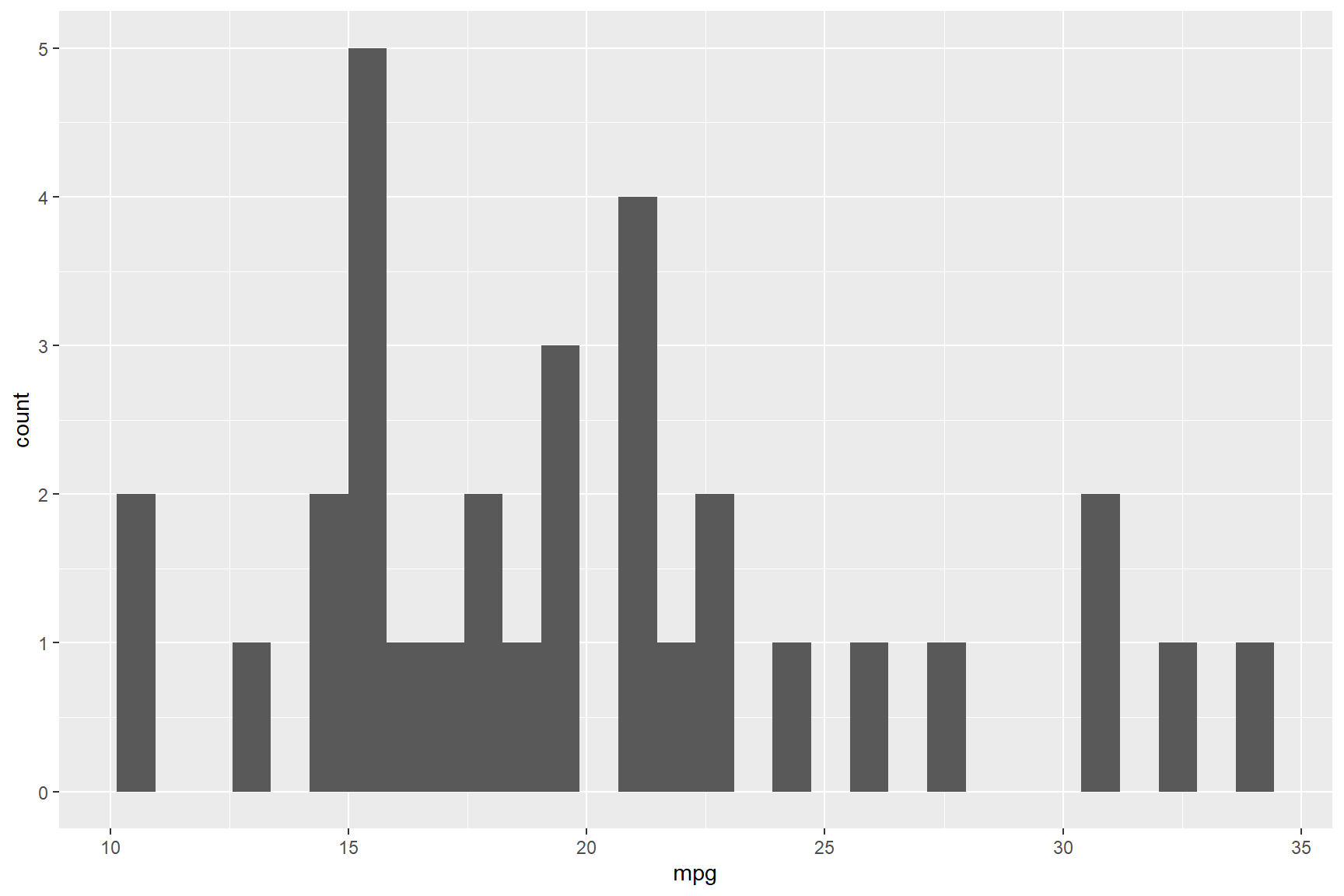
Because there are 32 car models in the mtcars data set
covering a relatively narrow range of values from 10.4 to 33.9 mpg
(range of 23.5 mpg), the default number of 30 bins is too high and has
several gaps where there were just no cars that performed within some
bin values. Redrawing this histogram with fewer bins (i.e., 8)
illustrates a better story about the mileage variation of the cars in
the data set; most cars in the data set drove approximately 20
miles-to-the-gallon of petrol.
ggplot(data = mtcars) +
  geom_histogram(aes(x = mpg), bins = 8)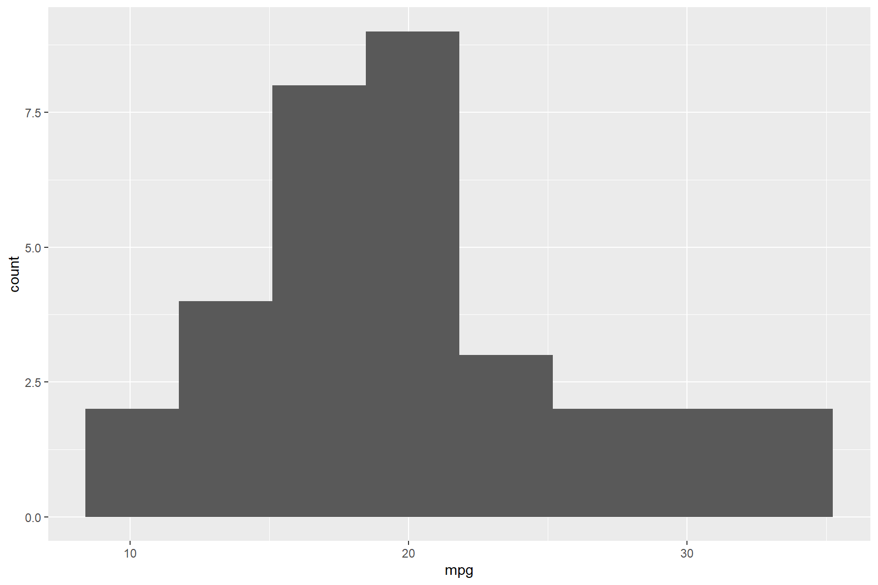
As with all the other above geom_ layers, you can use
the fill = and colour = arguments to customize
the plot with your desired colours. For example, if you wanted a red
histogram with black lines separating the bins, you could run the
following code.
ggplot(data = mtcars) +
  geom_histogram(aes(x = mpg), bins = 8, colour = "black", fill = "red")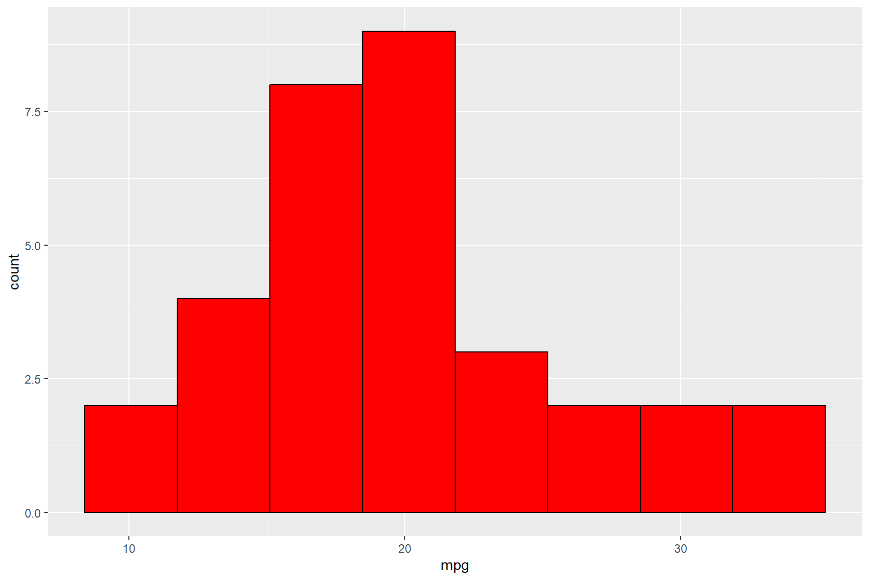
Please note that anytime you use characters (i.e., letters) to define a value, such as for colours, you must bound the name of the colour in quotation marks (i.e., “black”, “red”, etc)
A common alternative to a histogram is a density plot, using
geom_density. A density plot is like a smoothed histogram
(you can check the help file for information on how to alter the
smoothing bandwith).
ggplot(data = mtcars) +
  geom_density(aes(x = mpg), colour = "black", fill = "red")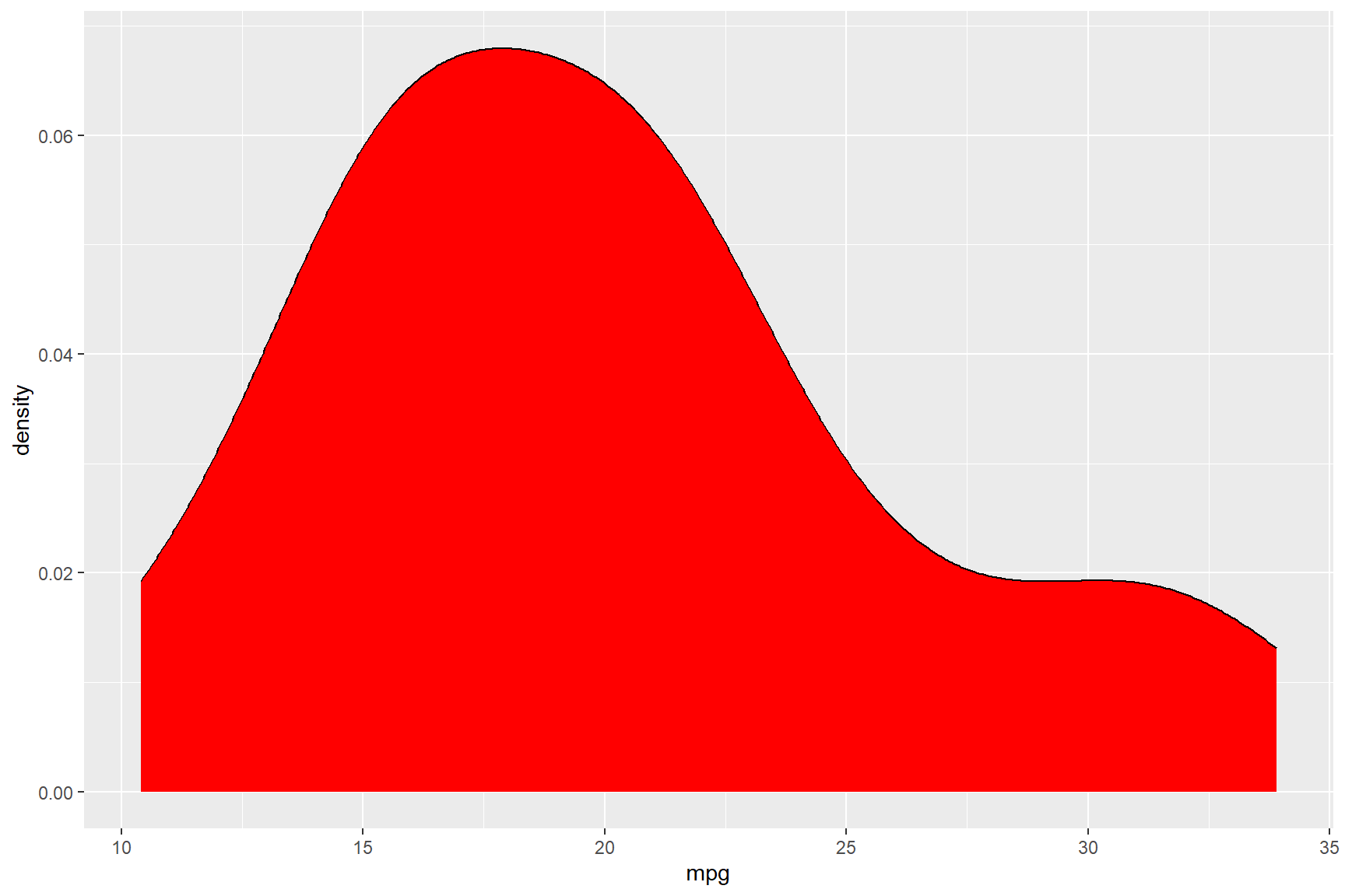
Themes
As promised in the section above about
geom_bar/geom_col, we will look at themes a little
more in-depth. The theme() function can be used to
customize the non-data parts of ggplot figures.
These include:
- axis labels
axis.text - the plot title
plot.title - the legend title
legend.title - the white space around the plot
plot.margin - the colour of text elements
element_text(colour = ) - typeface of text elements
element_text(face = ) - the size of text elements
element_text(size = ) - the justification of text elements
element_text(hjust)andelement_text(vjust)
and so, so much more. Let’s generate a ggplot figure and
change elements within it using the theme() function.
Tip:
theme() function arguments tend to be written either as
a single word, or multiple words separated by a . and
followed by a =. (See ?theme for more details)
For example theme(axis.text.x = ),
theme(legend.title = ), theme(plot.margin),
theme(title)
Following a theme() argument you will usually find one
of six theme elements that categorize how the components are drawn in
the figure.
- element_blank() - draws nothing
- element_rect() - for borders, backgrounds
- element_line() - draws lines
- element_text() - adds text
- margin() - changes the margins of white space around an object in the following order: top, right, bottom, left.
- rel() - specifies size relative to the parent element
Theme element functions themselves (except for
element_blank(), which has none) have a number of
customizable arguments followed by an = symbol.
This means that when you write the code for several lines of
theme() functions, a pattern between () and
= becomes visible to help keep track of what you are
coding.
theme(axis.text.x = element_text(size = 14)) +
theme(legend.title = element_text(face = "bold")) +
theme(plot.margin = margin(2, 2, 2, 2, "cm")) +
theme(title = element_blank())
Using the mtcars data set once again, we will create a
bar graph with geom_col depicting each car model’s
400-meter speed (qsec) in order from fastest to slowest,
and colour the bars by the number of carburetors (carb)
that each car model has.
Notice that in the reorder() function, the
qsec variable is preceded by a - symbol. This
codes geom_col to order the cars in descending order
by qsec, and once again, we can reclassify a variable in
the same line of code, as is done by classifying carb as a
factor in the code below (factor(carb)).
ggplot(data = mtcars) +
geom_col(aes(x = reorder(rownames(mtcars), -qsec), y = qsec, fill = factor(carb))) 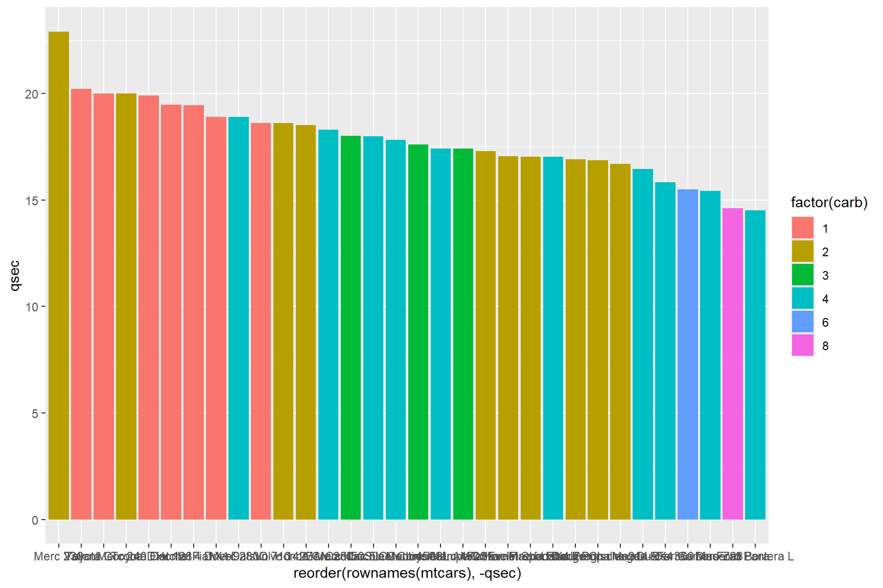
The text on the x-axis is unreadable, let’s start there! The names of each car model are so long that they overlap with each other, so let’s rotate them 90° with the following code.
ggplot(data = mtcars) +
  geom_col(aes(x = reorder(rownames(mtcars), -qsec), y = qsec, fill = factor(carb))) +
theme(axis.text.x= element_text(angle = 90, hjust = 1)) 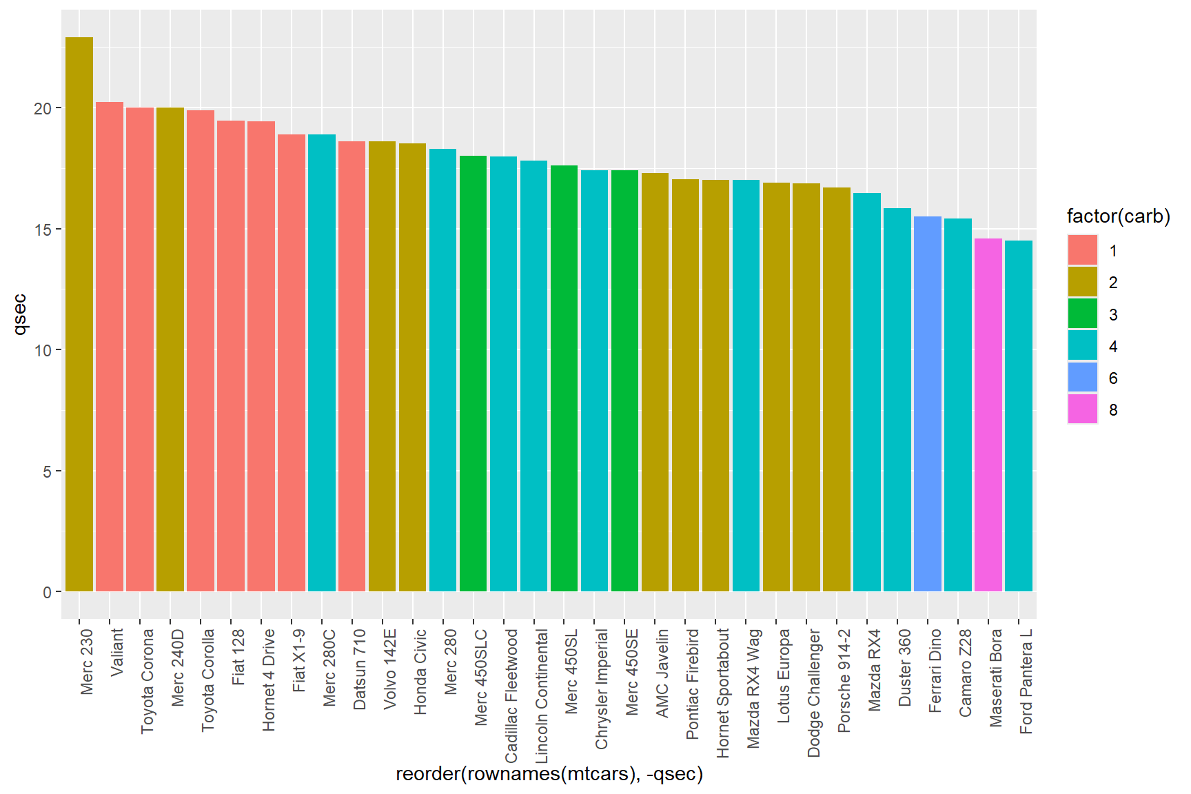
The code
theme(axis.text.x = element_text(angle = 90, hjust = 1))
rotates the x-axis text 90° counter-clockwise, and makes the text
right-aligned with hjust = 1 (hjust = can have
values of 0 (left-aligned), 0.5 (centered) and 1 (right-aligned)).
The resulting plot is much easier to read, but the grey background of
the plot is a bit distracting (and ugly if you ask me). We can swap it
out for a white background in a couple of ways; by changing the
panel.background to white (by using the word “white” or by
using the hexidecimal colour value 000000),
theme(panel.background = element_rect(fill = 000000))
Or we could use any of the “Complete themes” that come with a white
panel background, such as theme_bw,
theme_classic, theme_linedraw,
theme_light. Do keep in mind though, that complete themes
often include other theme element arguments such as text size, text
alignment, etc, and may have attributes that you don’t want. When in
doubt, use trial and error and don’t be afraid to code each argument
yourself.
In the following code, I will use the theme_classic()
function to change the background colour.
ggplot(data = mtcars) +
  geom_col(aes(x = reorder(rownames(mtcars), -qsec), y = qsec, fill = factor(carb))) +
  theme(axis.text.x = element_text(angle = 90, hjust = 1)) +
  theme_classic()
Built into the theme_classic complete theme, the text
direction is set to default, and because we put it in the ggplot code
after the line of code where we stipulated the direction of text,
the theme_classic overwrote it.
This is a key rule of ggplot themes, each successive layer you add
takes precedence over any features it shares in common with a layer
before it. You can just reorder them, in the above case, by
putting theme_classic() before
theme(axis.text.x = element_text(angle = 90, hjust = 1))
and you will get the white background and keep the text formatting where
the text is rotated 90 degrees.
ggplot(data = mtcars) +
  geom_col(aes(x = reorder(rownames(mtcars), -qsec), y = qsec, fill = factor(carb))) +
  theme_classic() +
theme(axis.text.x = element_text(angle = 90, hjust = 1)) 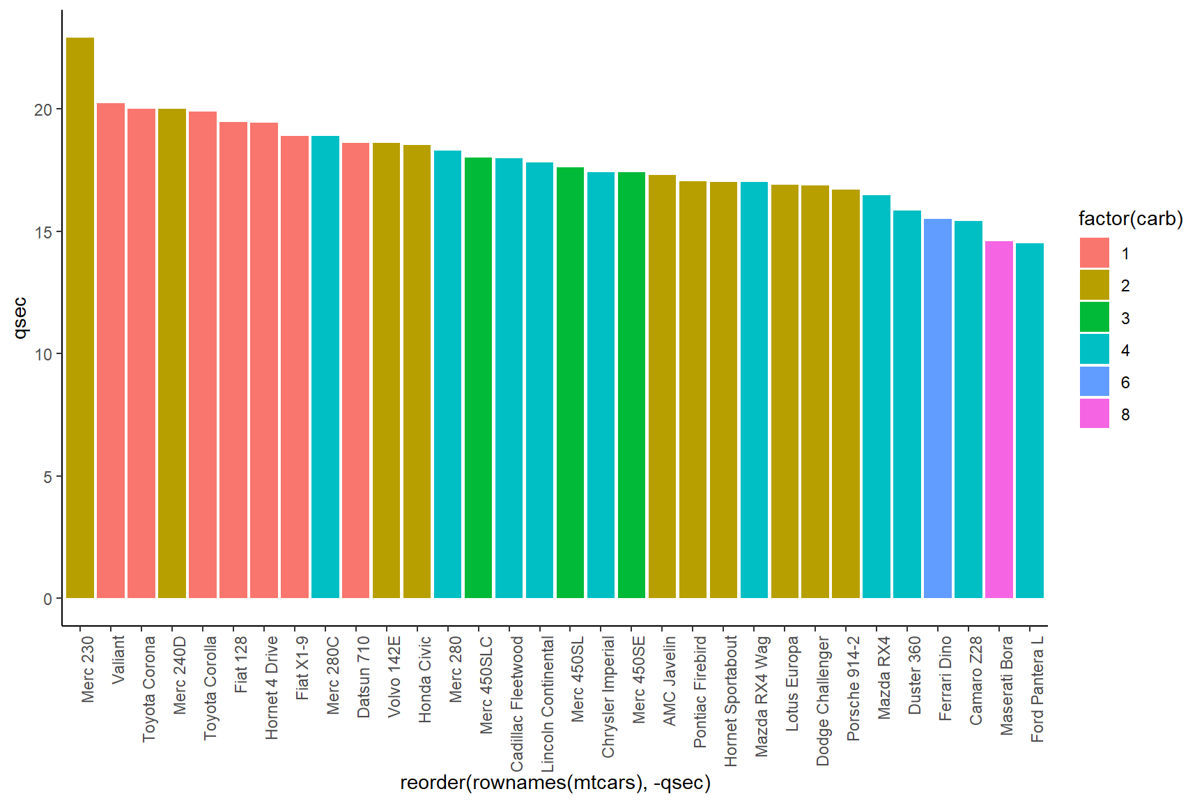
Facets
The ggplot function includes a component called faceting
that allows you to call data from the data layer into multiple plots.
This could allow us to see how the mileage of 4-, 6-, and 8-cylinder
cars performed based on the number of carburetors they have.
To do this, let’s set up a basic scatter-plot of time to 400-meters
(qsec) x miles-per-gallon (mpg) and colour the
points by the number of cylinders (cyl) that the cars
have.
ggplot(data = mtcars) +
  geom_point(aes(x = qsec, y = mpg, colour = factor(cyl)))
Then add a new line for facet_grid. The
facet_grid() function includes arguments
rows = and cols = that can use the
vars() function to separate your data by
variables.
In our case, we want to see how each combination of number of
carburetors and number of cylinders (both categorical variables) affects
the correlation between mileage (mpg) and time to
400-meters (qsec).
ggplot(data = mtcars) +
  geom_point(aes(x = qsec, y = mpg, colour = factor(cyl))) +
  facet_grid(rows = vars(factor(cyl)), cols = vars(factor(carb)))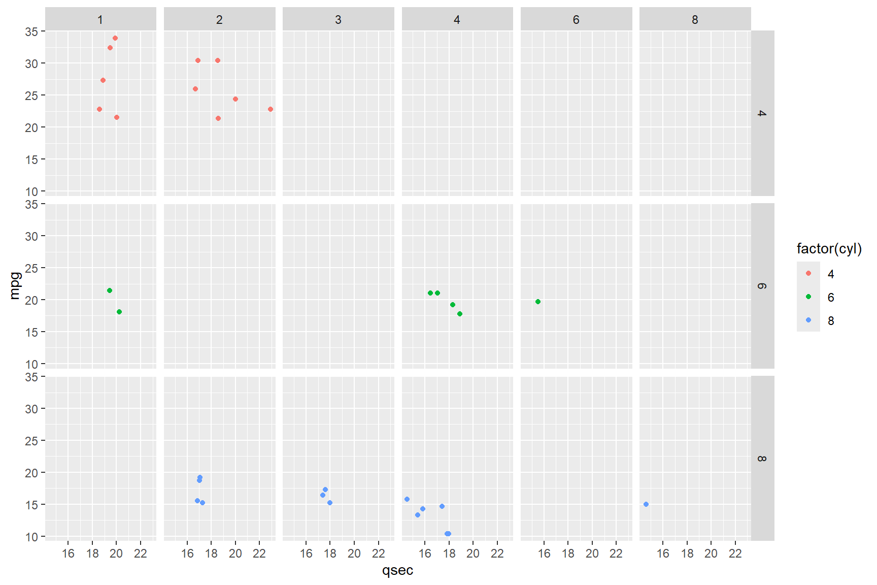
You now have a figure that a reader could evaluate each combination of engine size and number of carburetors and its associated mileage separately. This would be especially useful with data where there was a lot of overlap in the ranges of the variables.
Scales
In that last plot, it is not clear to a reader who is not familiar with this data set what each of the abbreviations for the variables mean. Let’s change the labels in the last plot by changing the default scales for labels. By default, ggplot uses the variable names in the data layer to label plots. Since we often name our data with abbreviations or codes that only we understand, it is really useful to know how to change the names in your plots so that all readers will understand.
The below code chunk uses four lines to change the default labels of the facetted plot:
xlab()- allows you to rename the x-axis labelylab()- allows you to rename the y-axis labellabs()- allows you to rename labels within a plot. Ultimately, you could rename x- and y-axes and the plot title using this one function if you wanted withx =,y =,title =arguments. NB:colour =renames the legend title, which is part of the ‘cheat’ in the below figure to name the right-side axis.ggtitle()- allows you to rename the plot title.
Tip:
If you need the text in a title or axis label to have two lines, you
can use the characters "\n" in between words where you want
the hard return to appear, as I have done with the legend label “Number
of cylinders.”
ggplot(data = mtcars) +
  geom_point(aes(x = qsec, y = mpg, colour = factor(cyl))) +
  facet_grid(rows = vars(factor(cyl)), cols = vars(factor(carb))) +
  xlab("Time to 400 meters (s)") +
  ylab("Miles per US gallon") +
  labs(colour = "Number of\ncylinders") +
  ggtitle("Number of carburetors")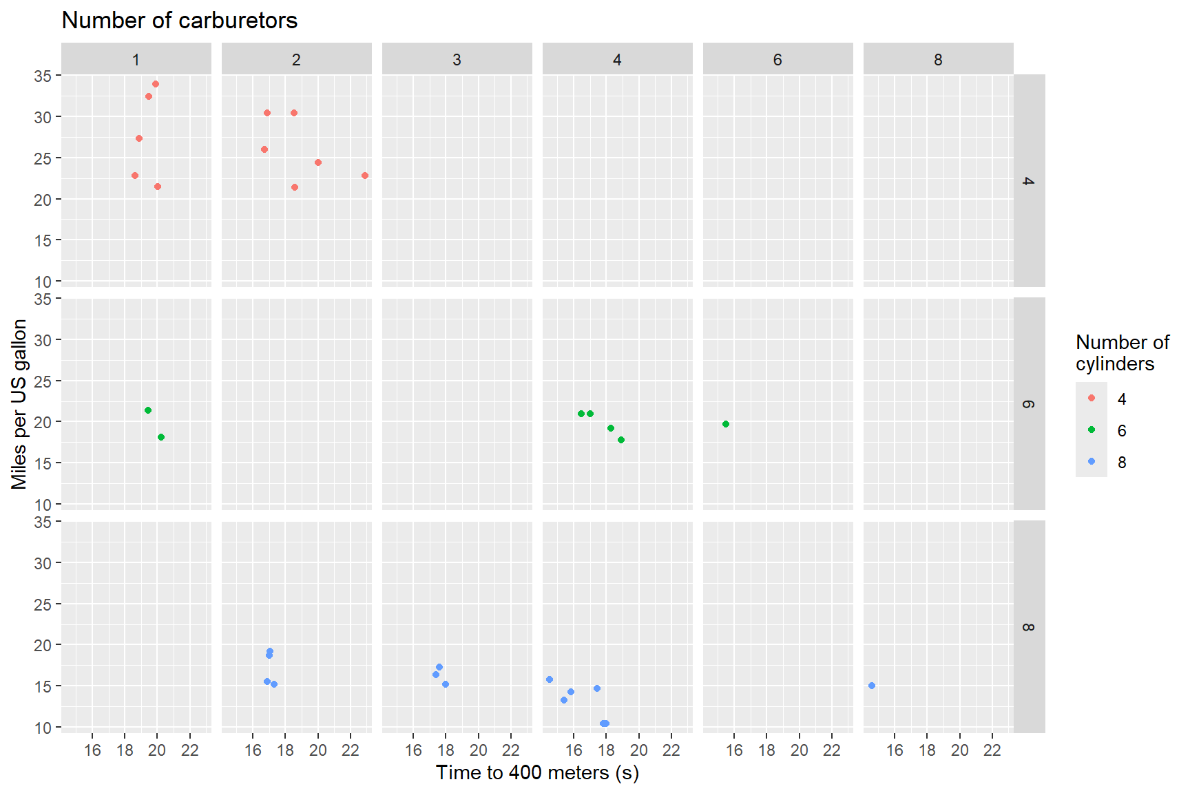
There is still more that we can do with the above figure to make it a
bit better. The label for carburetors at the top is left aligned, when
it should be centered to match the other axis labels, and the ‘label’
for number of cylinders is actually just the legend, which isn’t really
necessary for the figure. Let’s remove the legend and add an axis label
to the right side of the plot; this means revisiting the
theme() function along with some other adjustments.
- We can easily remove the legend by adding
theme(legend.position = "none")to our ggplot. - Then we can center the title (a.k.a. label for number of
carburetors) using the
hjust =argument like so:theme(plot.title = element_text(hjust = 0.5)). - The workaround for the right-side labels is a bit more convoluted.
First we change the argument in
labs()fromcolour =totag =so that it now readslabs(tag = "Number of cylinders"). “Tag” in this context is the name a label that is displayed at the top-left of a plot. We are going to further manipulate this argument below so that it will be displayed along the right y-axis. - By using the
theme(legend.box.margin = margin(l = 20),argument we can get ggplot to put the text fromtag =along the left margin of the legend, 20 pixels from the plot(l=20). The text appears where the legend would be if we hadn’t removed it, in the right margin of the plot. - The
plot.tag = element_text()and ’plot.tag.position = c()` arguments allow you to fine-tune the direction of text and the coordinates of the center of the text, respectively.
ggplot(data = mtcars) +
  geom_point(aes(x = qsec, y = mpg, colour = factor(cyl))) +
  facet_grid(rows = vars(factor(cyl)), cols = vars(factor(carb))) +
  theme(legend.position = "none") +
  theme(plot.title = element_text(hjust = 0.5)) +
  xlab("Time to 400 meters (s)") +
  ylab("Miles per US gallon") +
  ggtitle("Number of carburetors") +
  labs(tag="Number of cylinders") +
  theme(legend.box.margin=margin(l=20),
        plot.tag=element_text(angle=-90),
        plot.tag.position=c(1.03, 0.5)) +
theme(plot.margin = margin(0,1,0,0, "cm")) 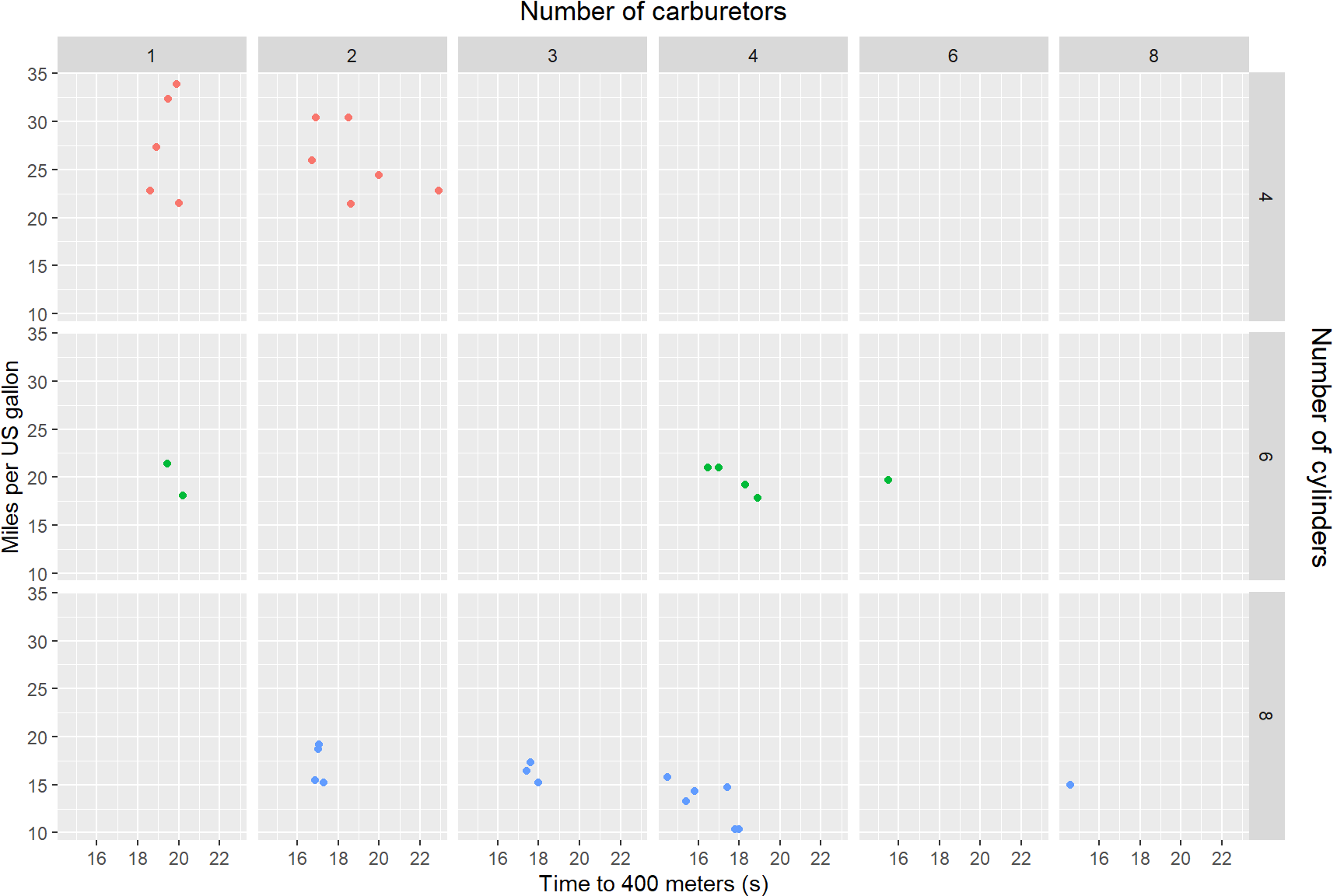
Some final thoughts
ggplot2 is an extremely powerful and flexible data
visualisation package. We have only covered a handful of key ideas here,
but there are many more geoms that you can use in creative ways
(particularly tiles, ribbons, lines, and errorbars), and many other
packages that build on the framework of ggplot to do other more complex
things (like, for example, ggmap).
Because there is so much you can do it can feel overwhelming to learn, but with practice you can do quite amazing things. In many situations the biggest challenge is having your data organised in the right way (e.g., with each variable that you want to use in a mapping as a column), and so developing skills in data wrangling can help you produce the visualisations that you want.