Graphs in R
In base R, there are various sets of functions that allows to create wide range of basic plots to explore and communicate your data effectively.These basic plots include barplots, histograms, boxplots, scatterplots, lineplots and pie-charts. The type of plots depends on the type of your variables and the specific research question you seek to answer through your visualization.
Example dataset
For the purpose of our examples here, we will use an in-built data set named ‘mtcars’ which contains fuel consumption and 10 aspects of automobile design and performance for 32 automobiles. You can read about the data using
?mtcarsHere are the first 6 rows of the dataset,
head(mtcars, data=mtcars)## mpg cyl disp hp drat wt qsec vs am gear carb
## Mazda RX4 21.0 6 160 110 3.90 2.620 16.46 0 1 4 4
## Mazda RX4 Wag 21.0 6 160 110 3.90 2.875 17.02 0 1 4 4
## Datsun 710 22.8 4 108 93 3.85 2.320 18.61 1 1 4 1
## Hornet 4 Drive 21.4 6 258 110 3.08 3.215 19.44 1 0 3 1
## Hornet Sportabout 18.7 8 360 175 3.15 3.440 17.02 0 0 3 2
## Valiant 18.1 6 225 105 2.76 3.460 20.22 1 0 3 1Types of plots
Histogram
Histograms are one of the most simple and useful ways to visualize
continuous data. It divides the range of values into intervals(bins) and
displays the counts or frequency of observations falling into each bin.
It is useful to check the shape and spread of a data. We can use
hist( ) function to create basic histogram.
Lets look at the distribution of mpg(Miles/(US) gallon) from the mtcars dataset
hist(mtcars$mpg)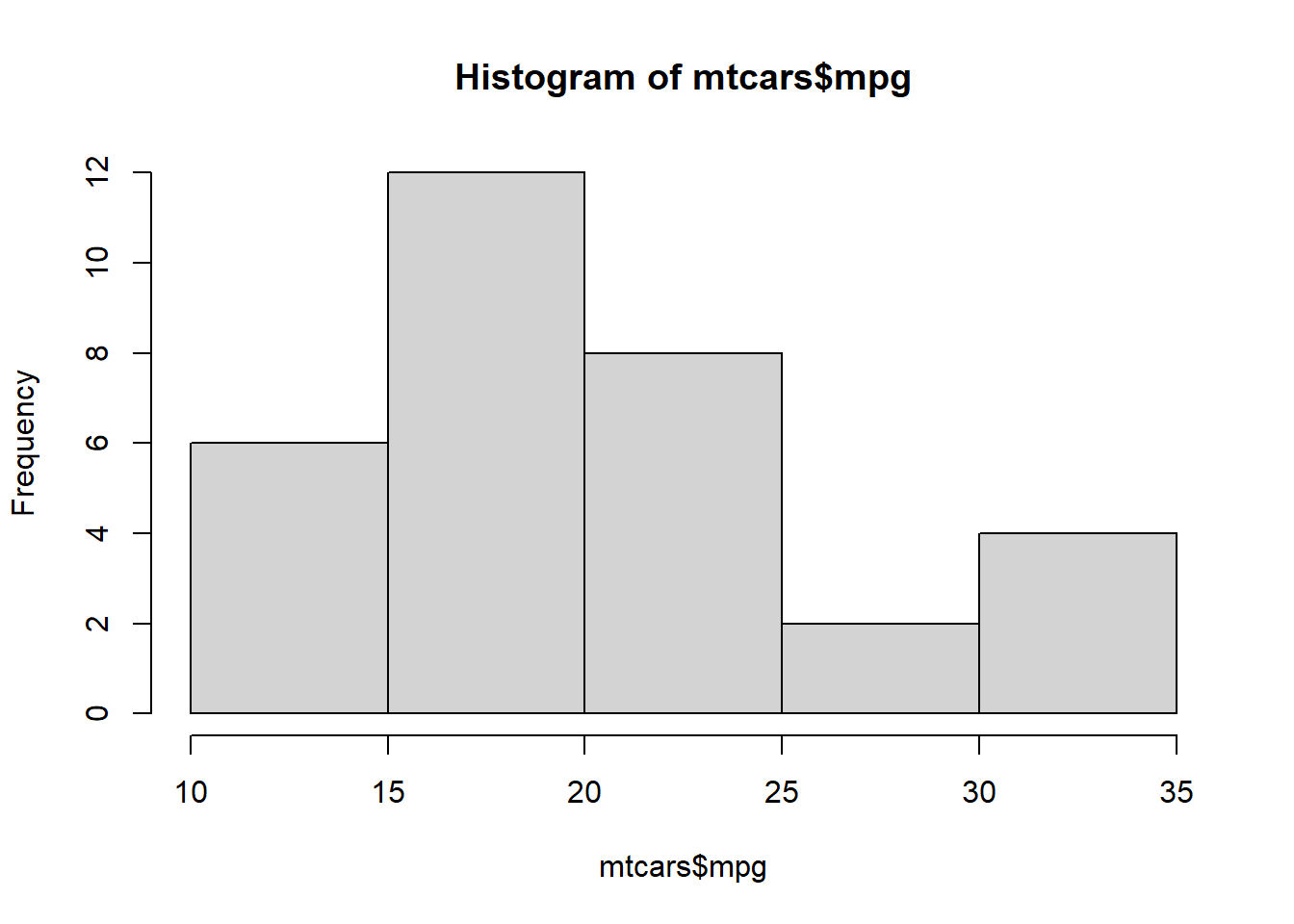
Customizing histogram
We can customize the histogram using various arguments in the
hist( ) function. Here are few useful arguments:
breaks: Allows to specify the number of bins/breaks.main: allows to set the main title of the output plot.xlabandylab: Allows to change the x-axis and y-axis labels.col: Allows to change the color of the bars.border: Allows to set the color of the boarders.xlimandylim: Allows to define the range of values for x-axis and y-axis.
We can add these arguments in the above graph:
hist(mtcars$mpg, breaks =10, main = "Customized Histogram", xlab = "Miles/gallons", ylab= "Frequency", col = "green", border ="red", xlim = c(10,40) )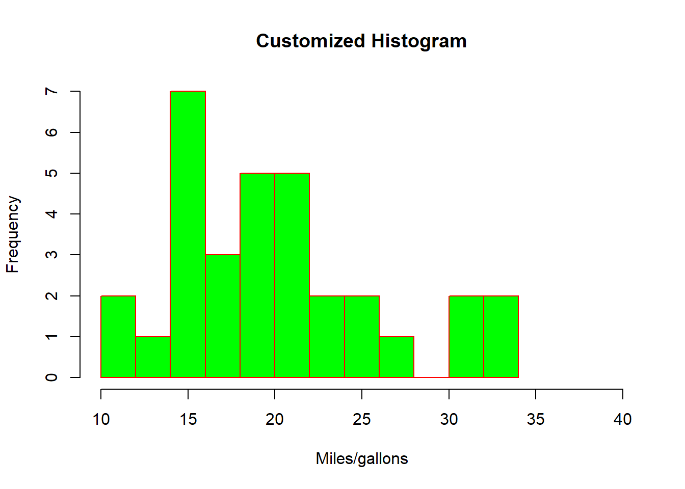
Here we have created a histogram of mpg with 10 bins, green fill with red border and customized axis label and limits.
Barplots
Barplots are useful when we want to visualize categorical data, it
displays and compare values/proportions between different
categories/groups. We can use barplot( ) function to create
basic barplots in R.
Lets draw a barplot that displays the number of automobiles in each
of the transmission categories. First step we can do is use
table( ) to get the counts as follows,
counts <- table(mtcars$am)
counts
##
## 0 1
## 19 13using barplot( )
barplot(counts)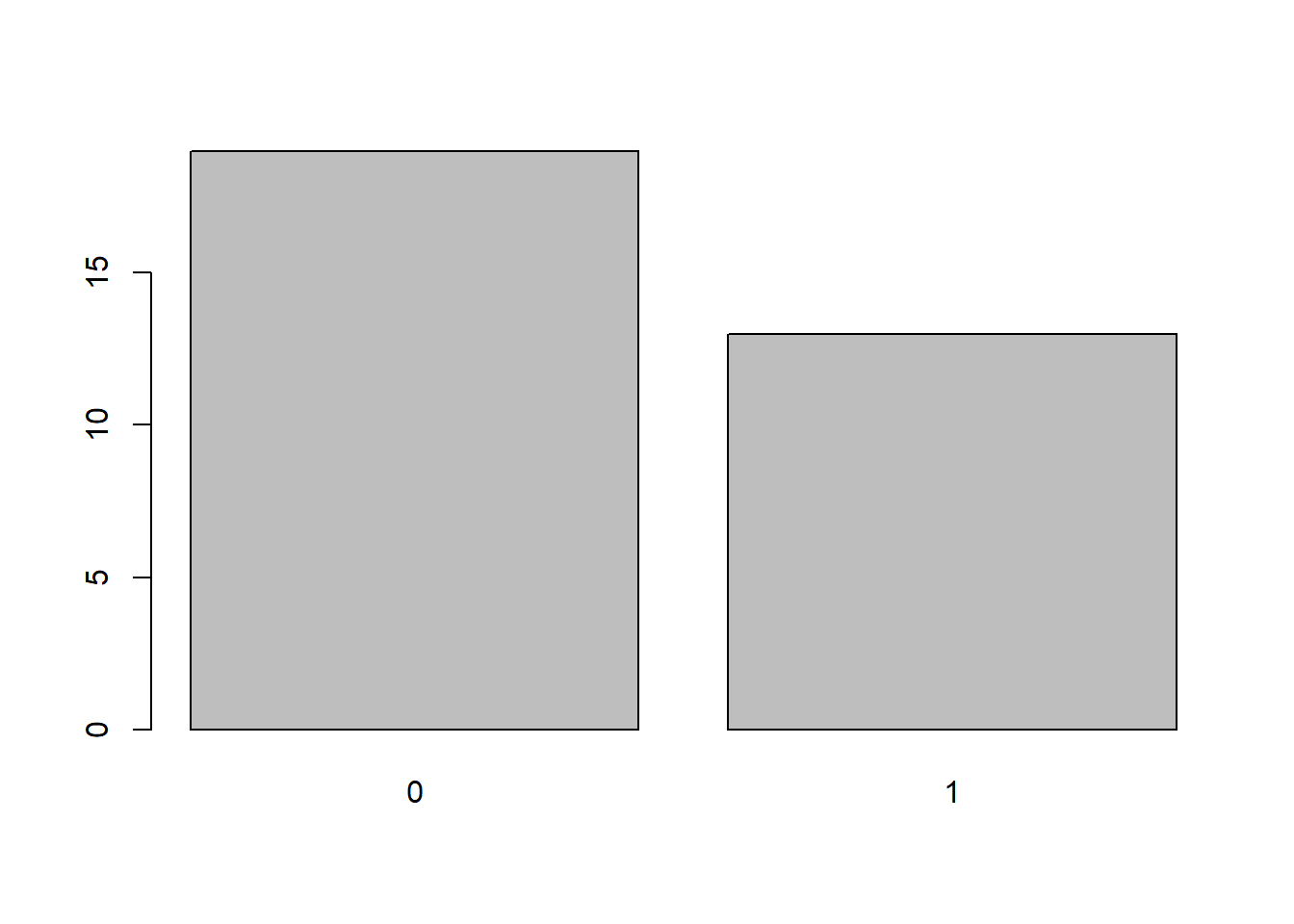
Customizing barplot
As in the histogram section, we can use main,
xlab and ylab,
col,border and xlim and
ylim arguments.
barplot(counts, main = "Customized Barplot", xlab = "Transmission type", ylab= "number", col = "blue", border ="red", ylim = c(0,25) )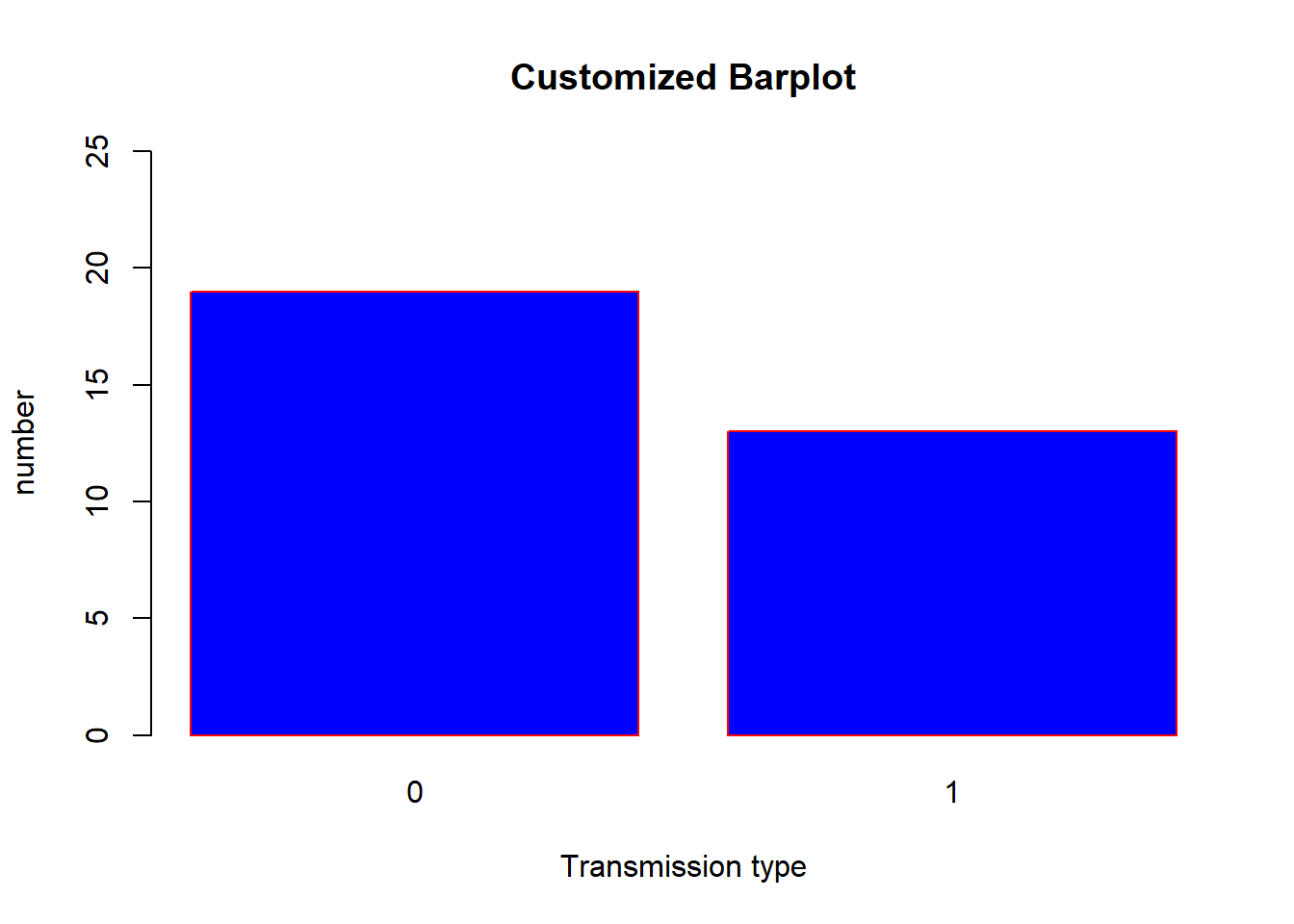
In addition we can also add the arguments,
names.arg: Allows to specify the labels of the categories on x-axies.horiz: Allows to chose if you want to have it displayed horizontally.
Lets add these two arguments in the above plot,
barplot(counts, main = "Customized Barplot", xlab = "Transmission type", ylab= "number", col = "blue", border ="red", ylim = c(0,25), names.arg = c("Automatic", "Manual") )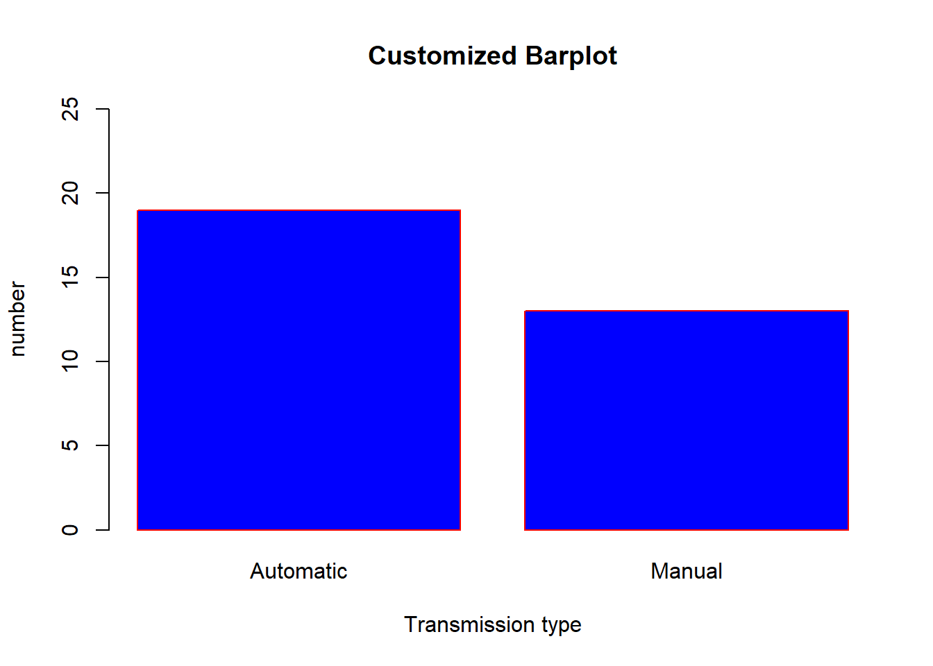
using the ‘horiz’ argument,
barplot(counts, main = "Customized Barplot", ylab = "Transmission type", xlab= "number", col = "blue", border ="red", xlim = c(0,25), names.arg = c("Automatic", "Manual"), horiz = TRUE)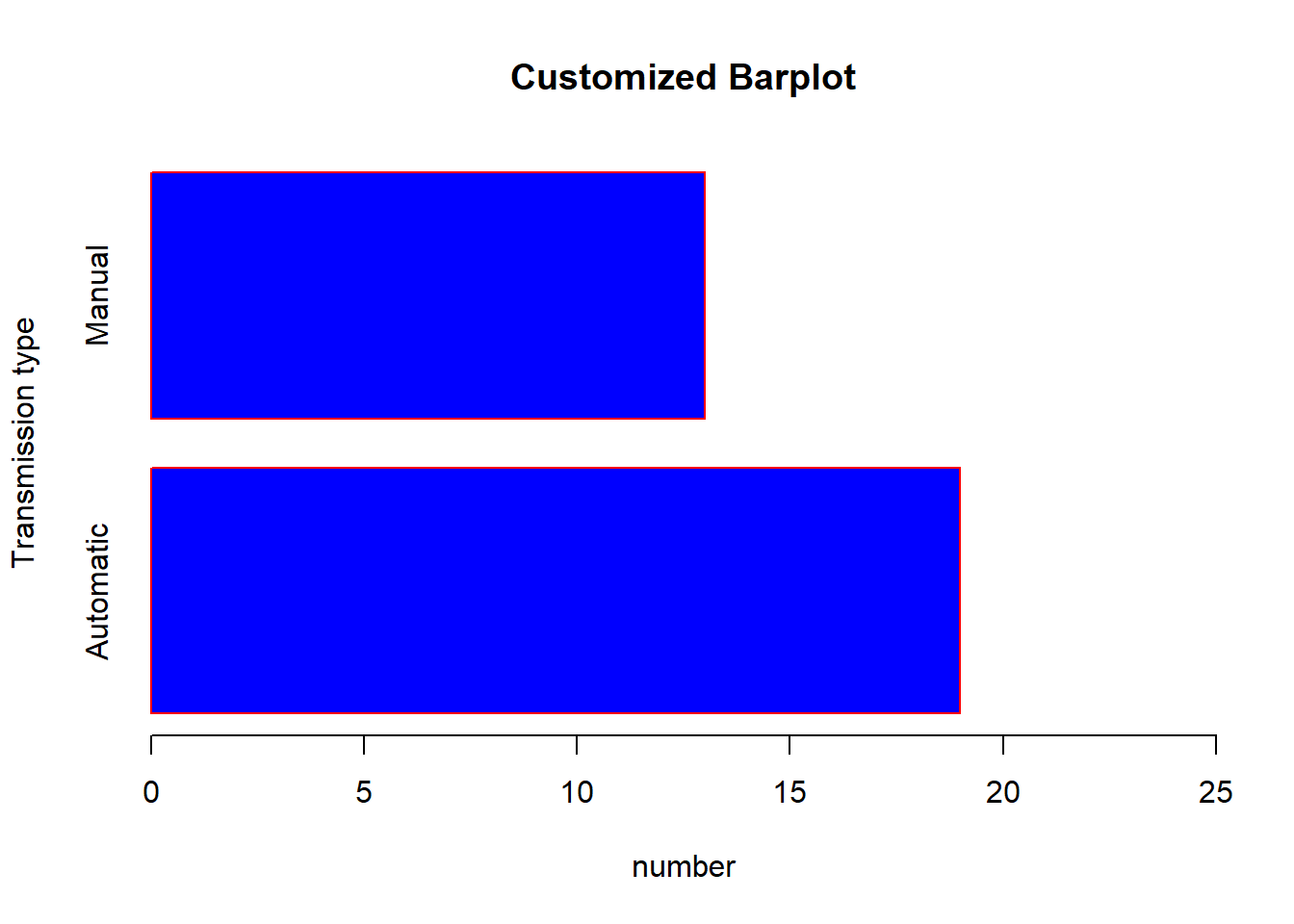
We can create barplot using proportions, prop.table( )
to create a table of proportions,
prop <- prop.table(table(mtcars$am))

barplot(prop, main = "Barplot using proportions", xlab = "Transmission type", ylab= "Proportions", col = "blue", border ="red", ylim = c(0,1), names.arg = c("Automatic", "Manual"))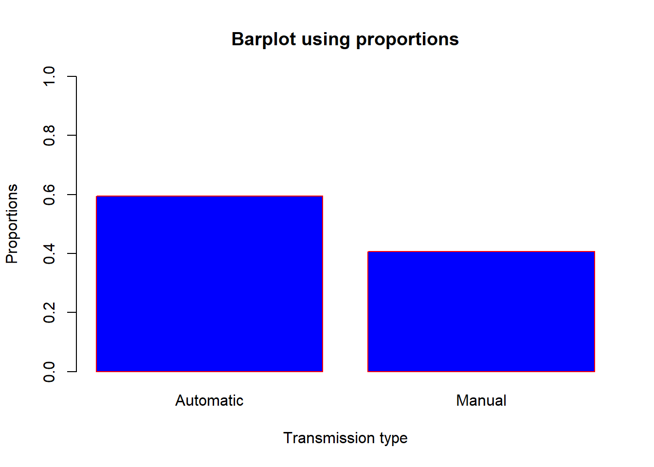
Stacked barplot A stacked barplot is a type of plot that uses bars divided into a number of sub-bars to visualize the values of multiple variables at once.
Lets create a barplot to visualize transmission type in the engine
categories. Lets again use the table( ) to get the counts
in each categories as follows,
counts1 <- table(mtcars$vs,mtcars$am)
counts1
##
## 0 1
## 0 12 6
## 1 7 7using barplot( ),
barplot(counts1, main="Car Distribution by transmission and Engine type",
  xlab="Number of Gears", col=c("blue","red"), ylim = c(0,25), names.arg = c("Automatic", "Manual"))
We can use additional arguments,
beside: Allows to plot side by side.legends: Add note to identify categories/groups.
barplot(counts1, main="Car Distribution by transmission and Engine type",
  xlab="Number of Gears", col=c("blue","red"), ylim = c(0,25), names.arg = c("Automatic", "Manual"),legend = rownames(counts1), beside=TRUE)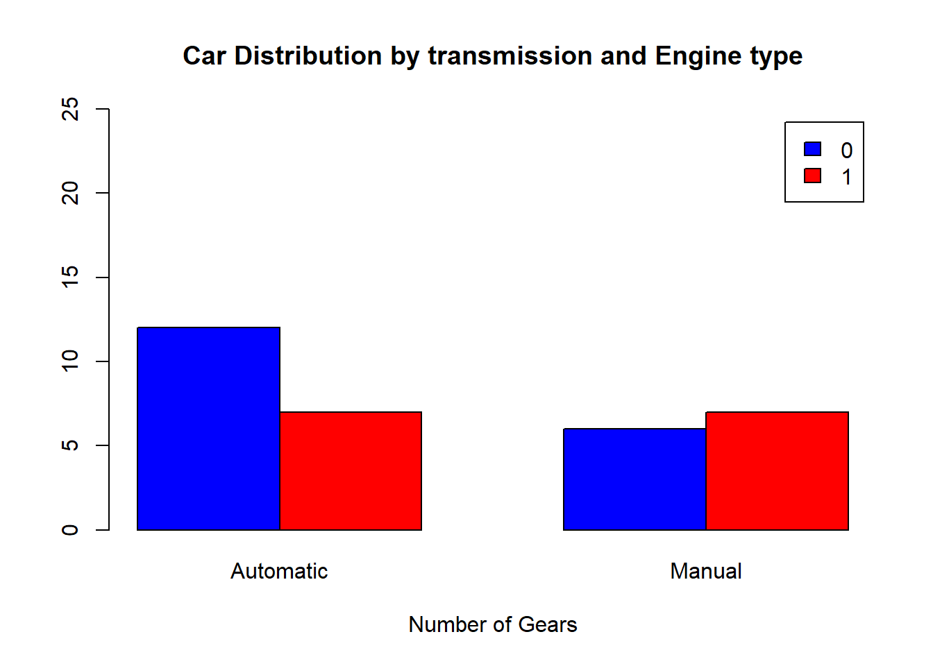
Scatterplots
Scatterplots are two-dimensional plots that displays the relationship
between two continuous variables. We will use the plot( )
function to produce scatterplots in R.
From the cars examples, lets look at the relationship between mpg(Miles/(US) gallon) and hp(Gross horsepower),
#plot with mpg on y-axis and hp on x-axis(use '~' to define mgp as a function of hp)
plot(mtcars$mpg ~ mtcars$hp)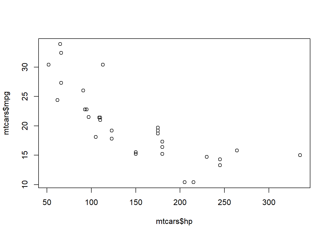
Note that there are two ways we could provide the data in the plot
command here. Above, we have used the $ symbol to provide
the data to the function as vectors. Alternatively, we could provide the
whole data frame and specify the columns, like
plot(mpg ~ hp, data = mtcars)This would produce exactly the same plot.
Customizing scatterplots
Again we can use the basic arguments like main,
xlab and ylab,
col,border and xlim and
ylim, plus pch, cex and
lwd to specify the plotting symbol, size of plotting text
and line width respectively.
plot(mtcars$hp, mtcars$mpg, main ="mpg(Miles/(US) gallon) vs hp(Gross horsepower)", xlab ="Gross horsepower", ylab = "Miles/(US) gallon", col = "blue", pch =20, cex=2, lwd=2)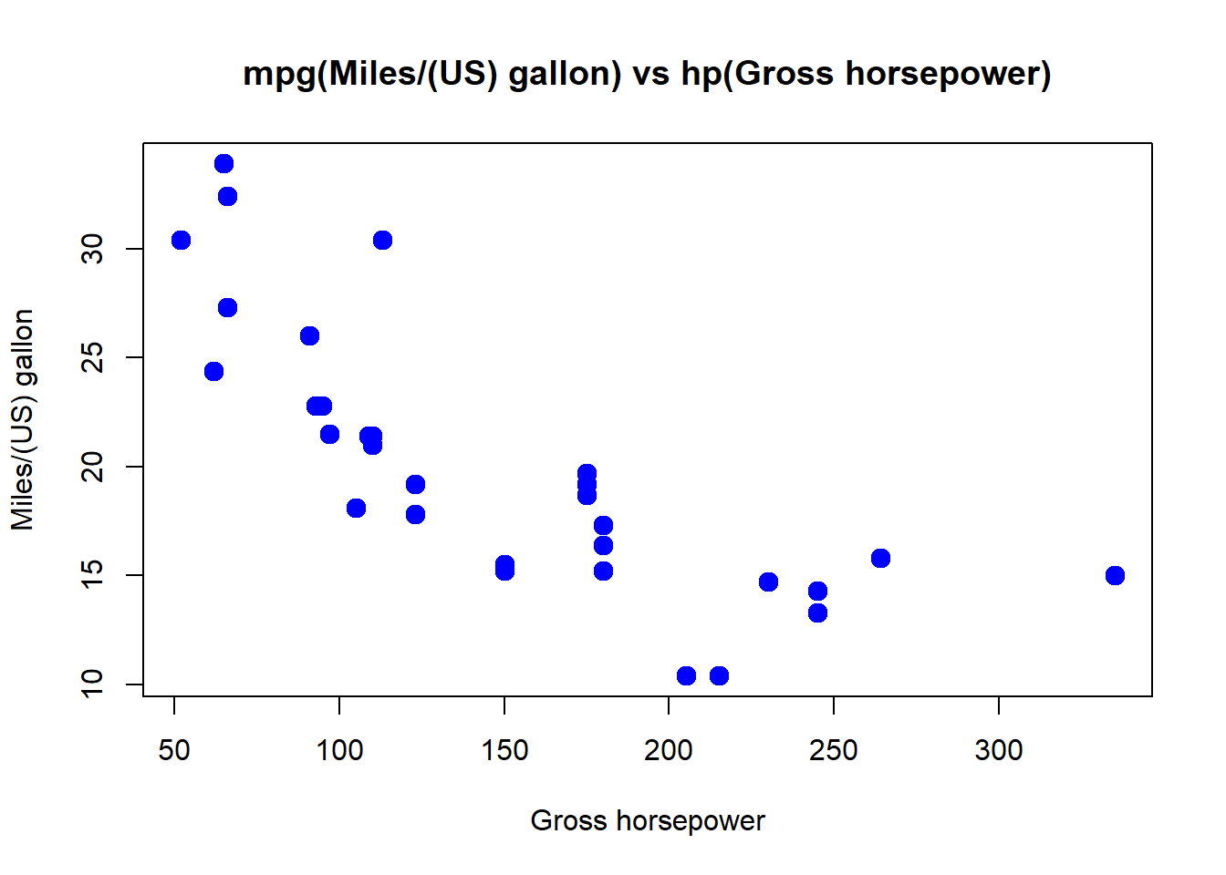
It will be useful to draw a simple linear regression line through the
data. This can be done with the abline( ) function. First
we need to fit a linear regression model using lm( ) which
models mpg(Miles/(US) gallon) as a function of hp(Gross horsepower).
Then we will use abline( ) function to generate the
regression line and fit it on the plot as follows,
plot(mtcars$hp, mtcars$mpg, main ="mpg(Miles/(US) gallon) vs hp(Gross horsepower)", xlab ="Gross horsepower", ylab = "Miles/(US) gallon", col = "blue", pch =20, lwd=2)

#This fit a simple linear regression model

mod <- lm(mtcars$mpg~mtcars$hp)

# Draws the regression line on the plot

abline(mod, lwd=3, col="red")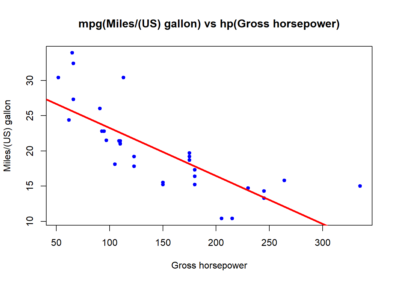
On the plot, we can have separate colors for different groups,
plot(mtcars$hp, mtcars$mpg, col=factor(mtcars$cyl), pch =20, cex=2)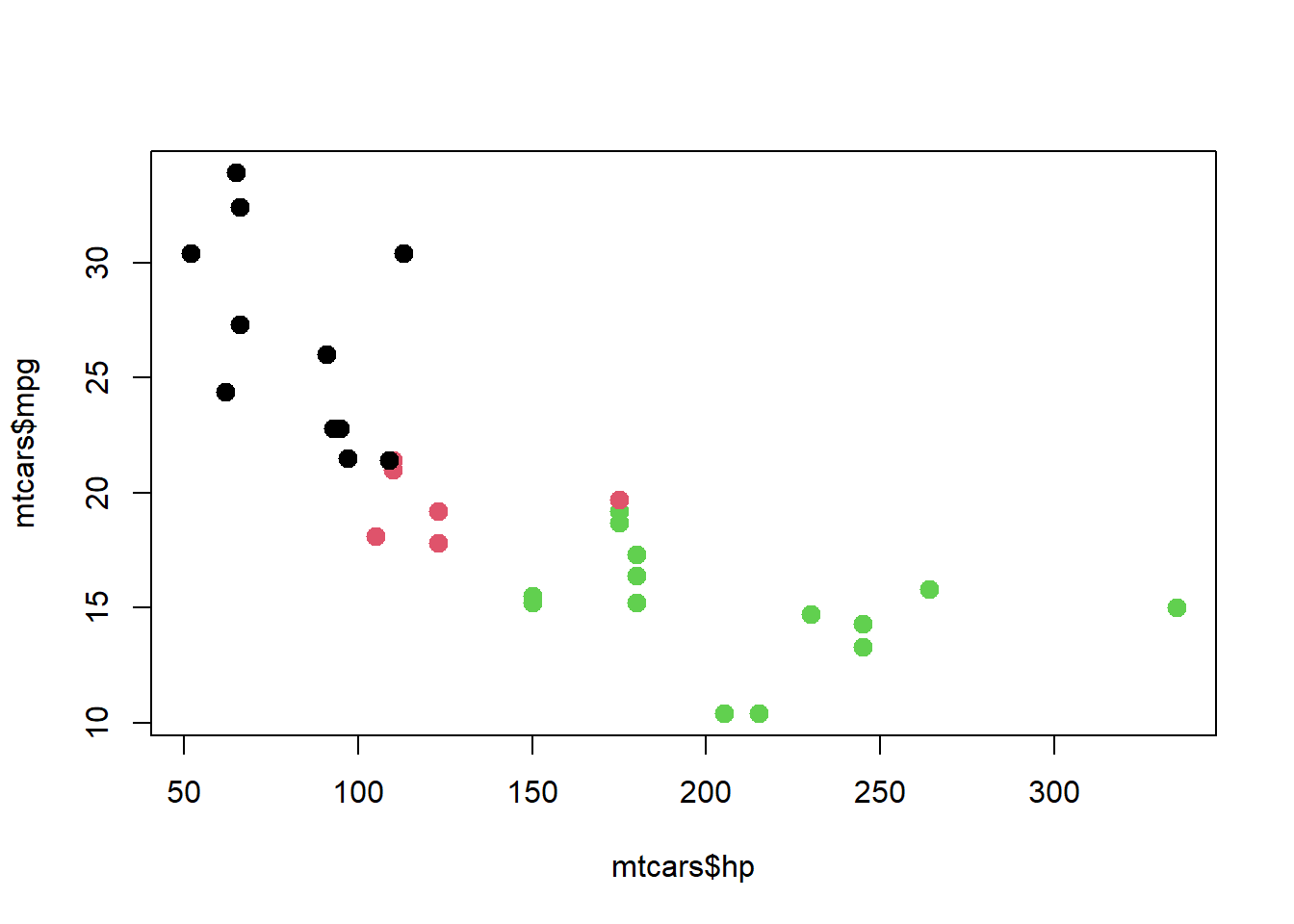
We can change the default color
#Select colors

colors <- c("blue", "orange", "green")

plot(mtcars$hp, mtcars$mpg, col=colors[factor(mtcars$cyl)], pch =20, cex=2)

# We can also add legend using additional command line
legend("topright",
       legend = c("4", "6", "8"),
       pch = 19,
       col = colors, title = "Cly")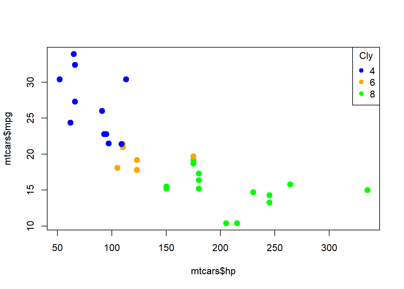
Boxplots
Boxplots, sometimes called a box and whisker plot’ are used to
display distributions and spread of continuous data. It shows the
median, interquartile range and the range of the data. It is very useful
for visualizing the variability and skewness of data, identifying
potential outliers, and making comparisons between different groups or
categories. We will use boxplot( ) functions to create
boxplots in R. Lets create a customized boxplot of the distribution of
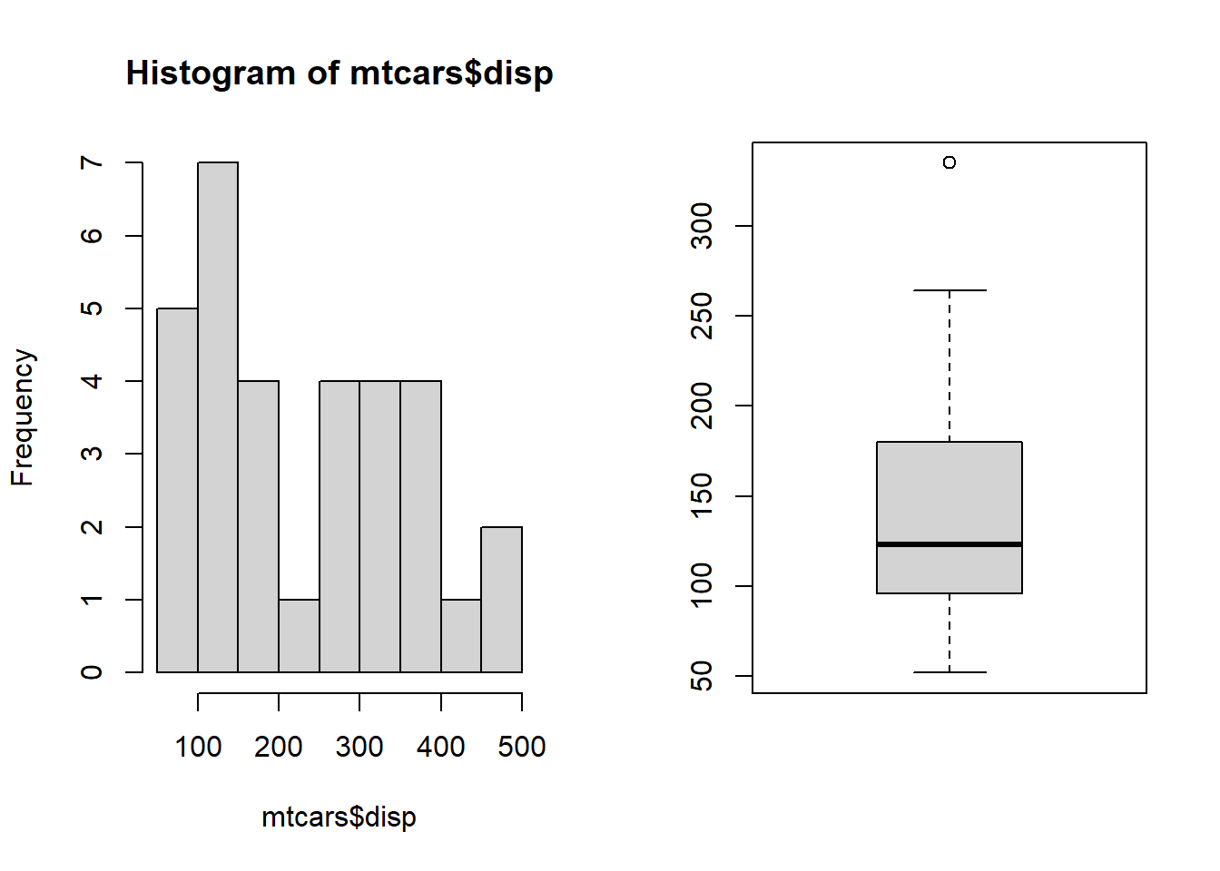
disp(Displacement (cu.in.)) from our example,
boxplot(mtcars$disp,main="Displacement of 32 automobiles", xlab ="32 Automobiles", ylab ="Displacement (cu.in.)", col="red")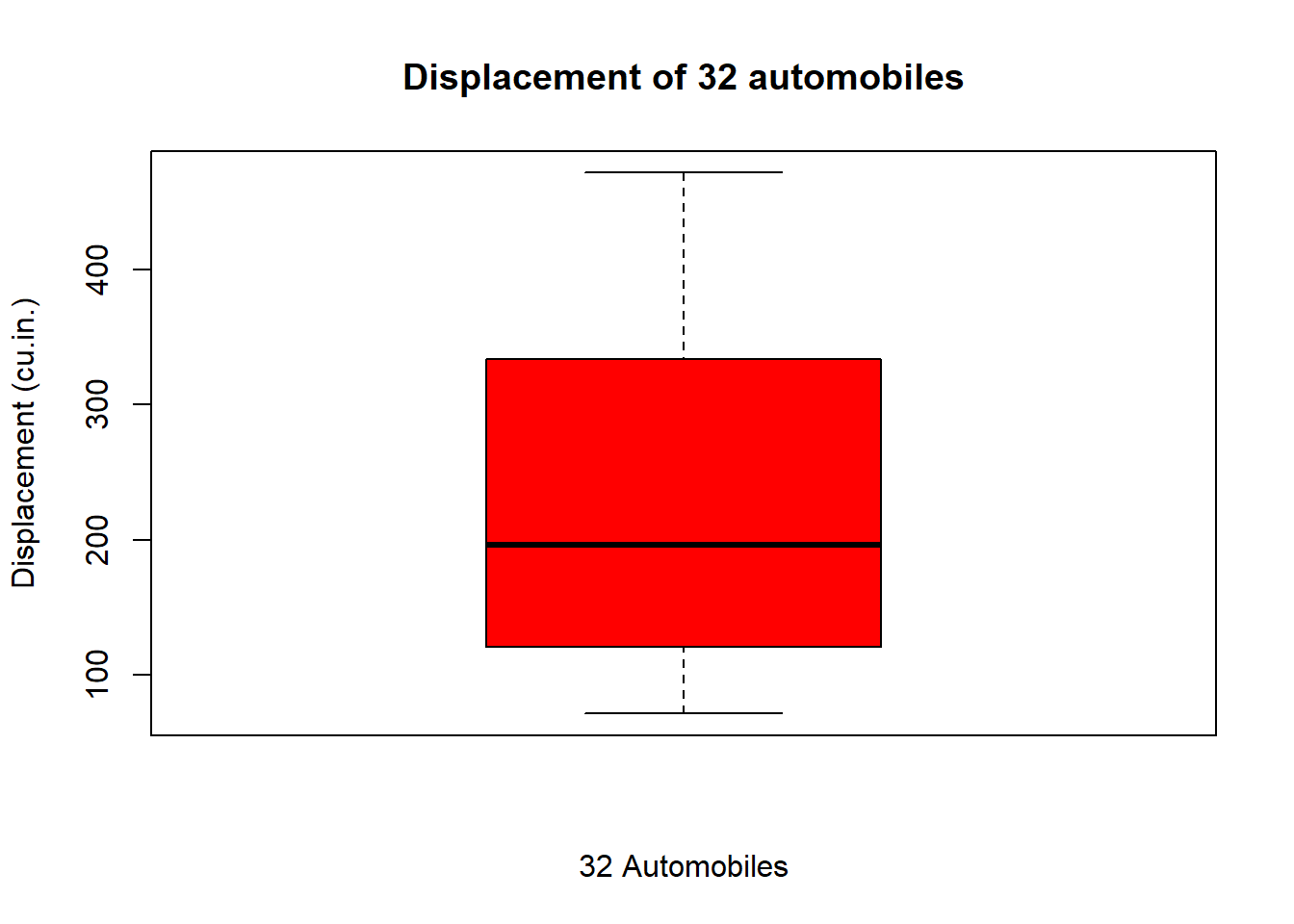
If you want a horizontal boxplot, we can use horizontal
argument as follows
boxplot(mtcars$disp,main="Displacement of 32 automobiles", ylab ="32 Automobiles", xlab ="Displacement (cu.in.)", col="green", horizontal = TRUE)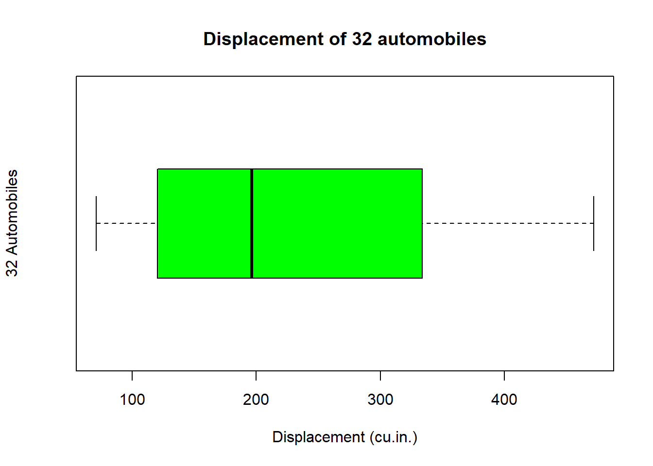
side-by-side boxplots Side-by-side boxplots are also useful for comparing multiple groups or categories. From our example, lets look at the distribution of disp Displacement (cu.in.) between type of engine (0 = V-shaped, 1 = straight)) as follows,
boxplot(mtcars$disp~mtcars$vs, main="Displacement among engine type", xlab = "Engine type", ylab ="Displacement (cu.in.)", col=c("yellow","orange"))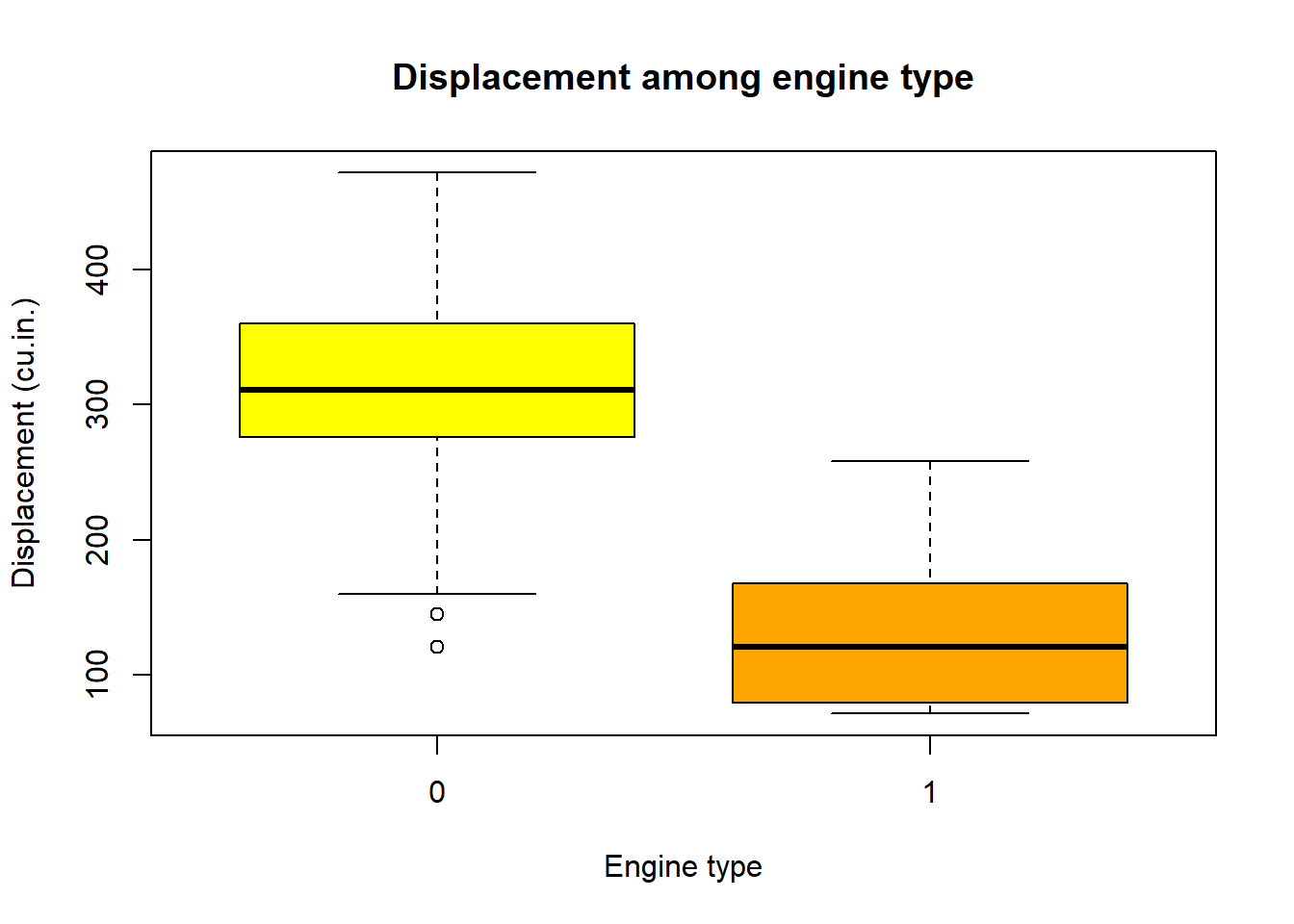
As with scatterplots, the following produces the same plot:
boxplot(disp~vs, data=mtcars, main="Displacement among engine type", xlab = "Engine type", ylab ="Displacement (cu.in.)", col=c("yellow","orange"))
We can change the names/labels using names argument, and
if you wish, add a notch to the boxes for comparing medians using
notch,
boxplot(mtcars$disp~mtcars$vs,main="Displacement among engine type", xlab = "Engine type", ylab ="Displacement (cu.in.)", col=c("yellow","orange"), names =c("V-shaped","Straight" ), notch = TRUE)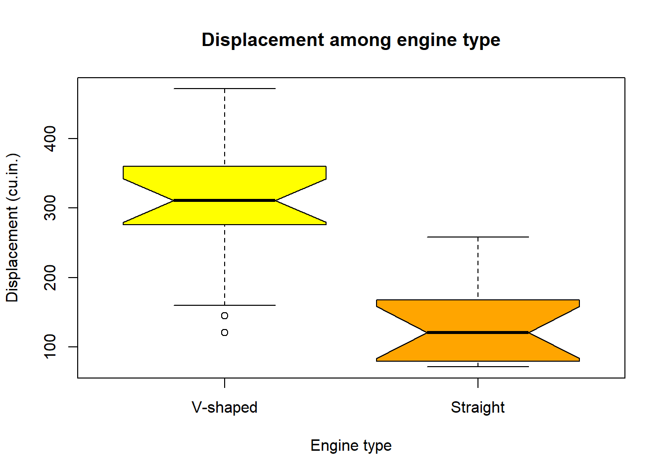
Mosaic plots
A mosaic plot are used to visualize the relationships between two or
more categorical variables in a contingency table. It is like a
segmented bar chart that displays the proportions of each category in a
visually proportional manner.We can generate mosaicplot in R using
mosaicplot( ) function. Lets loow at the mosaicplot for
cyl(Number of cylinders) and Transmission (0 = automatic, 1 =
manual),
#create a two-way table

counts2<- table(mtcars$am, mtcars$cyl)

mosaicplot(counts2, xlab = "Transmission type", main = "Mosaic plot of transmission and Numer of Cyliners", ylab="Number of Cylinders", col =c("green", "skyblue","orange") )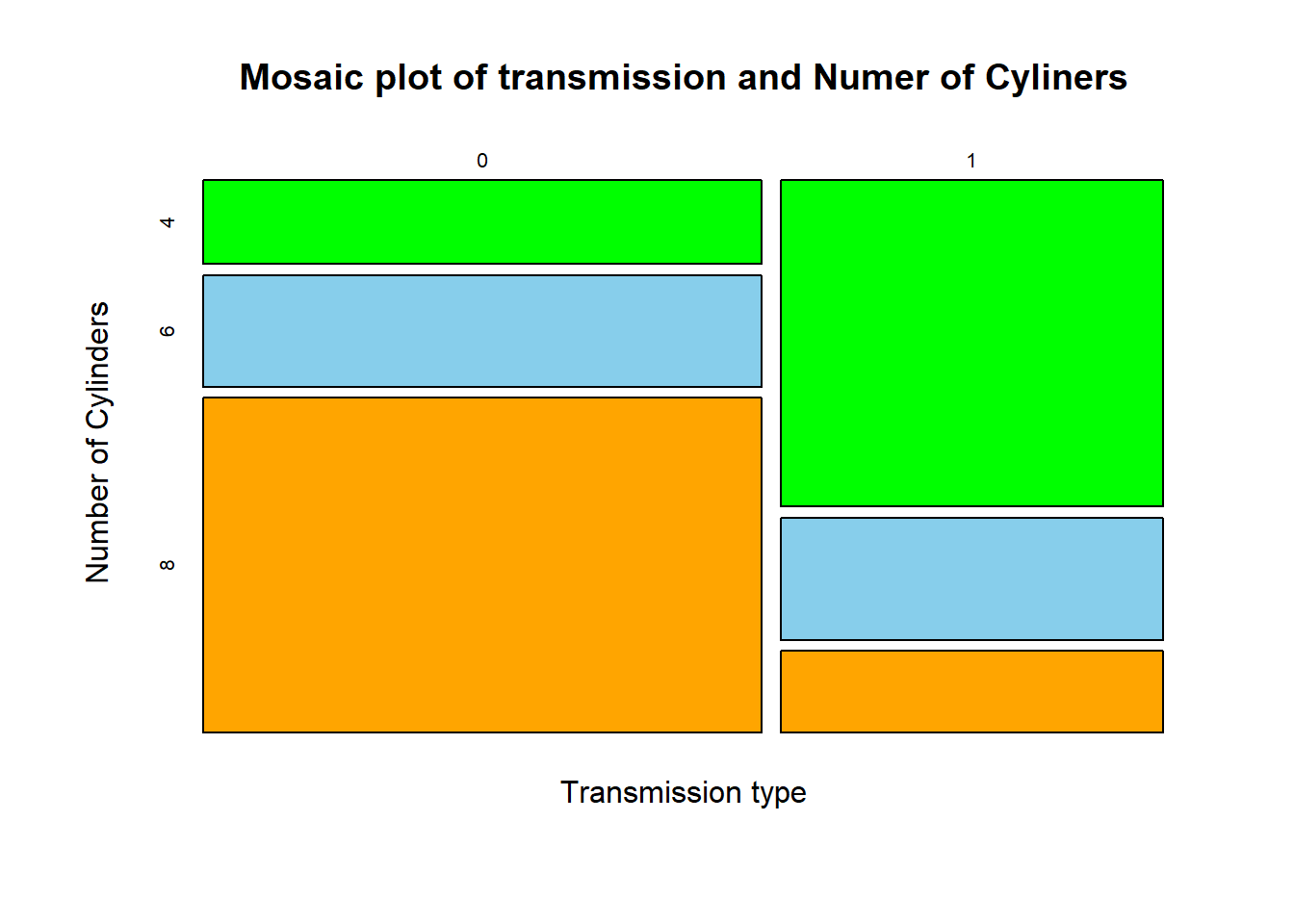
Multiple plots
Pair-plots
Pairs plot displays matrix of scatterplots, and is useful for
examining pairwise relationship between multiple variables. We can use
pairs( ) function to create pairs plot in R.
pairs(~ cyl + disp + drat + wt, data=mtcars)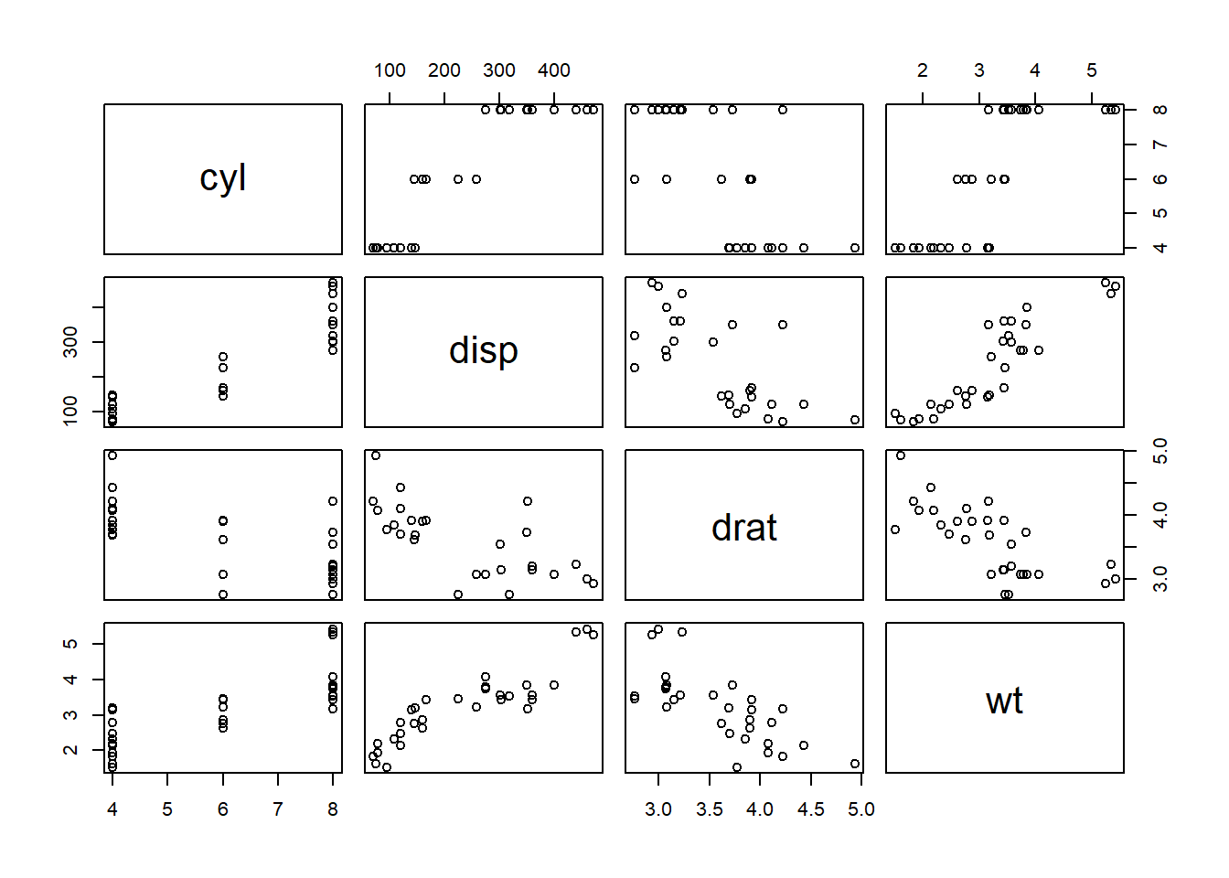
#the following would be equivalent
#pairs(~ mtcars$cyl+mtcars$disp+ mtcars$drat+ mtcars$wt)
We can change the labels using labels,
pairs(~ cyl + disp + drat + wt, data=mtcars, col="blue", main="Pairs plot",
      labels = c("Number of cylinders","Displacement (cu.in.)", "Rear axle ratio", "Weight (1000 lbs)"))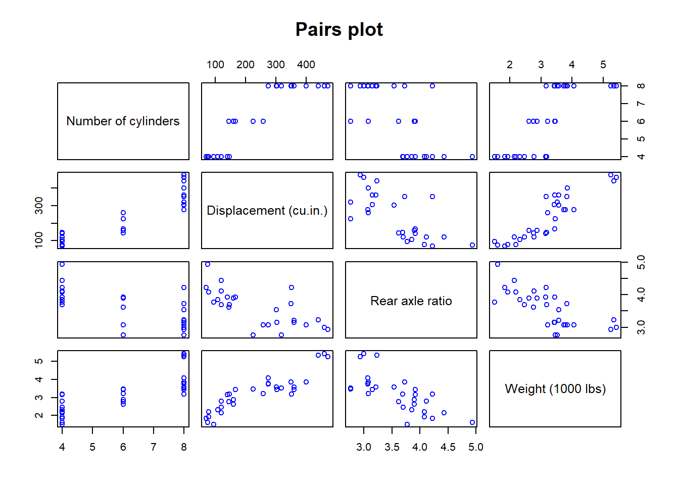
We can also make multiple plots side by side in a single plot window
using mfrow and mfcol in the
par( ) function.
par(mfrow= c(1,2)) # This specifies the plot window with one row and two column of plots

hist(mtcars$disp)
boxplot(mtcars$hp)